
Colour Philosophy in Architecture and Design – Part I (A Green Tale)
Many of us learned the acronym ROYGBIV as an aid to remember the order of the colours of the rainbow (red, orange, yellow, green, blue, indigo and violet) and most are also familiar with the colour wheel – which dates back to the mid-1600s when Sir Isaac Newton’s research involving white light led him to the discovery of the visible spectrum of light. Yet, the mention of colour philosophy bewilders people: many are able to distinguish between warm and cool colours, primary and secondary, but their knowledge often ends there.
Colour is a huge mood conditioner, emotional and subjective: it can bring joy and happiness and on the flipside sadness or even despair. Colour is frequently the most volatile element of any project; the interpretation of colour theory enables design professionals to truly represent the psychological needs of the client, and interpret how they want to feel in a space: introducing colour is very much an architectural addition to any space, giving it the ability to influence one’s feelings within a space.
“Colour – a tool in architecture as powerful as the ground plan and the section. Or better than that: polychromy, the very element of the ground plan and the section”. (Le Corbusier)
There is a plethora of approaches to analyzing colour: considering historical, cultural and social interpretations of colour are some of the more interesting places to begin. Any design professional who incorporates colour in their designs will concede that persuasion is key – often as high as 90% of the total design: advising the client to do the right thing, making an informed decision.
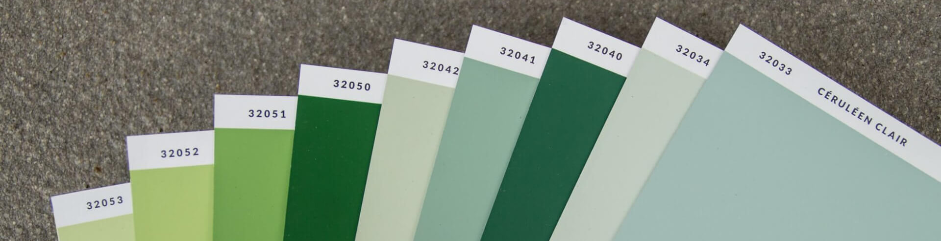
Let’s talk about green – the most common tone – comprised of equal parts yellow and blue. Green is the colour of nature, Spring: it references the environment and symbolizes fertility, growth and renewal. Extensive exposure has been given to biophilic design over the last year, and we have acknowledged that our inherent connection to nature is therapeutic and creates a feeling of space; whilst reinforcing our connection to nature; creating feelings of balance, healing and energy – in short green is like an elixir. Le Corbusier’s Architectural Polychromy contains nine green nuances: in shades appealing to everyone, and interestingly, they sit almost in the centre of the 1931 colour palette.

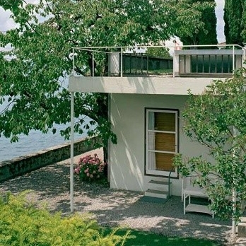
Le Corbusier’s Cité Frugès, in Pessac, France (constructed between 1924 and 1926), an experimental social housing development (comprising of 51 reinforced concrete buildings) was considered revolutionary. Le Corbusier set about creating a garden city promoting the health and well-being of inhabitants (an early advocate for biophilic design), and he believed that one priority would be to provide natural landscaping, in order to lift the residents’ mood. Unsurprisingly, green was a prominent exterior colour used at Cité Frugès.


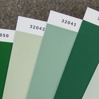
In image 3, we can see how Le Corbusier carefully considered the polychromy of the exterior walls. On examination, one can clearly see that the house in image 2 is the building second from the left on the top diagonal row.
Le Corbusier noted “It was necessary to appeal to colour to ease it up and to separate especially the houses from each other, to open up perspectives, to break the cohesion of the walls too close”. Le Corbusier felt the workers needed to feel close to nature and be energized by the colours. Despite some of the buildings being in disrepair, many still retain their original colours (check out google maps, street view). The palette he used for exterior masonry were greens (32040 vert anglais and 31041 vert anglais clair – in image 4), intense earthy tones (32120 terre sienna brûlée 31) and blues (32034 céruléen pale) – a somewhat greenish blue, and the third mural colour in the “sky” atmosphere. Note how the contrasting green and sienna culminate in a feeling of calm and opulence, offering sophistication, yet still connected with nature. The palette feels very grounded and timeless.

In summary, nature’s most plentiful colour promises a balance between the warm and cool spectrums. Green lovers are usually very social people: it’s important for them to win the respect of others, they are good listeners, generally kind and possibly a little risk averse, but that’s not always a bad trait. Green lovers are dependable and often visionary; green is an essential right now – it’s our connection with nature.


Comments
Very interesting this articule,Le Corbusier knew very well using colors.