
Colour Philosophy in Architecture and Design – Grey (A Dorian story) - Part I
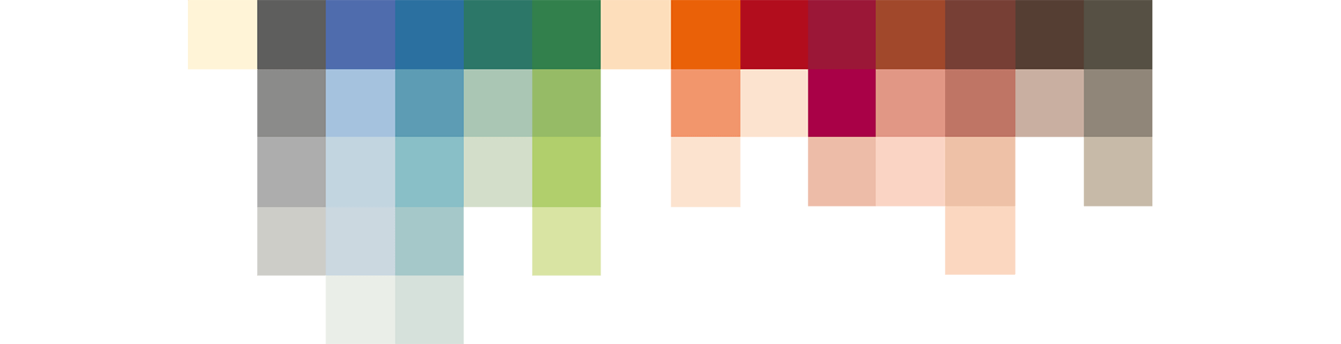
Grey is one of today’s most prevalent neutrals, possessing more stronger and lighter tones than perhaps any other neutrals. Unlike pastels, grey’s fundamental property is to act as a background shade, it’s pared-back elegance taking on the qualities of other surrounding colours. Grey has been popular for centuries and the trend of using it in interiors undoubtedly shows no signs of waning. Grey is the Dorian Gray of the neutrals – whereby its timeless outer beauty reflects its inner goodness, not the recurring negative reference of Grey’s desperation for perfection!

Neutrals are naturally subdued hues which echo shades found in nature: picture natural rock, stone, sand, earth and a pile of smooth pebbles stacked up on a deserted beach. Reflect on how their achromatic hues balance out brighter colours and how easily they blend together in a harmonious combination, almost mimicking the organic strata of rock found at nature’s source. Grey’s neutrality really means that it is quite uneventful, doesn’t attract attention at all and can create quite a heavy sense of being. Many people feel that using greys, whether in clothing, furniture, paint, fabric or anything can offer that sense of anonymity, almost detaching themselves from anyone or anything: they can just cocoon themselves in grey and feel safe. Grey can be one colour which brings solace, reliability and comfort from whatever else is happening in one’s lives. However, after a sustained period of time grey can leave one feeling drained, tired and emotionally low.
All of Le Corbusier’s Architectural Polychromy are found in nature in some shape or form, which explains why its colours fit together so organically, and his greys are no exception. With the vast selection of warm greys and cool greys, often come multifaceted permutations, such as warmer greys with pink, green or brown tones. Cool greys can often be interpreted as perhaps more sophisticated, being blue or black and white based. Grey creates an ambiance which is calm, sophisticated, contemporary and feeds the soul. It is a peaceful colour which is elegant and timeless and can easily be used to highlight architectural features. The fact that it is bland and non-competing is why it works so surprisingly well with so many (often unexpected) colour combinations.
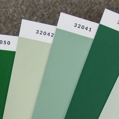
Let’s consider some melodious combinations: the classical grey and blue – generally speaking a cool grey would work best with a cool blue, and likewise, warm greys with warm blues. However, unexpected combinations, such as Le Corbusier’s 32013 Gris clair 31 beautifully complements 32030 Bleu Céruléen 31, a very rich dynamic blue which attracts colour and has a real presence, but doesn’t overpower the airy lightness of the Gris clair 31; instead it adds intrigue and balance.


Grey and yellow is another spectacular marriage of colours: the joyfulness of a bright yellow (4320W Le jaune vif) adds energy to any grey but doesn’t overpower it; equally 4320L Ocre jaune clair with 4320U Gris foncé 59 is particularly sophisticated, especially when introducing the contemporary 4320E noir d’ivoire into the mix.


There is much symbolism in grey: envisage the dying embers of a camp fire, the grey smoke swirling in the dawn sky, coupled with the silvery grey ashes and powdery grey dust on the ground. If there is a breeze the embers can circle up as if they are dancing – what an evocative image that is. It reminds one of what was before, ashes to ashes dust to dust that we hear at burial services. Grey can feel quite melancholy, sobering and often feel quite oppressive.
Grey is widely prevalent in architecture, especially in urban settings. This is because most construction materials are predominately grey: concrete, steel and reflective glass, and any combination of the afore-mentioned creates a grey urban collage. The impressive brutalist architecture of Barbican which became Grade II listed back in 2001 is hypothetically immortal, just as Dorian Gray whose soul was trapped within the painting. There are so many parallels between Dorian Gray’s character and grey the hue: Gray and Grey alike never ages, they are classic and timeless, forever young, coveted by many and considered a curiosity.
“Human nature is not black and white but black and grey.” – Graham Greene
In summary, grey represents calm, sophistication, wisdom and is of course overarchingly architectural. Grey is a neutral, its implicit absence of colour being one of its key benefits and the ability it has to form an ideal background shade, complementing brighter colours within an arrangement. It is found in either the warm or cool spectrums, and through understanding the effects it can have on one’s psyche, the correct selection of grey shade can easily be determined. So, embrace your inner grey, see grey as a symphony: we can experience greys through allegros, slow sombre movements, minuets, but always be mindful to consider its psychological properties and how it works in unison with the other colours in its composition.


Comments
No Comments