How light affects colour (pigments and refraction in Les Couleurs)
The relationship between light and colour is extremely powerful and complex: the amount of light which is cast onto any colour massively affects its value and intensity. Light waves are some of the many waves which are located on the electromagnetic spectrum - yet, light waves are the only waves which are detectable to the human eye. The extraordinary way in which light touches colour often produces some unexpected and complex surprises as to how we perceive colour. Every colour that the human eye sees is a by-product of spectrum light, as it is absorbed onto or conversely reflected off an object. A pigment is any material which absorbs light: its colour comes from the wavelengths of light which are reflected – i.e. those which are not absorbed.
Considering natural light, one can easily notice how colour varies throughout the differing nuances of changing daylight/nightlight; a simple time-lapse video on your phone can clearly illustrate this. Art galleries typically have neutral white lighting installed – the light emulates daylight and offers a balance between warm and soft light colours. When referring to degrees’ kelvin, the higher the figure, the whiter the colour temperature. It’s well known that incandescent bulbs emit yellow light: whereby making colours appear warmer, compared to fluorescent and cool white bulbs which emit a bluer tinged light creating a cooler feeling with any colour it falls upon.
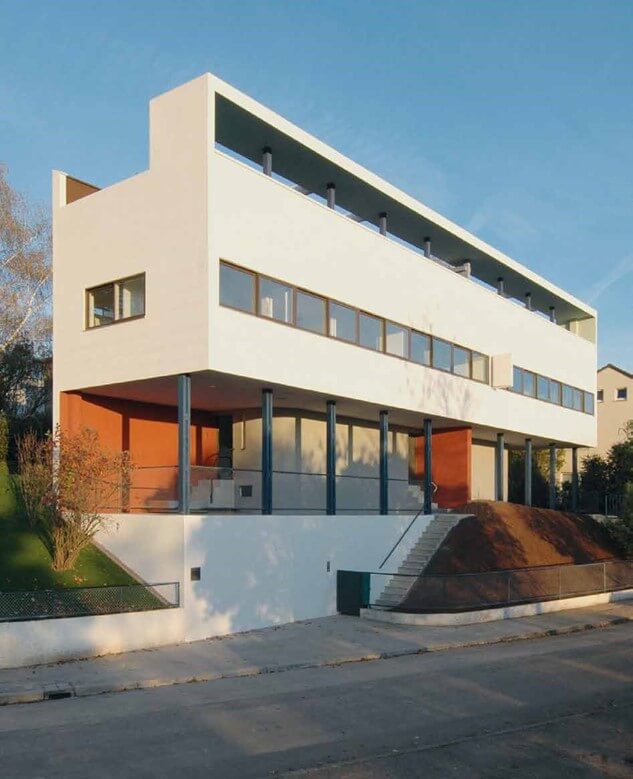
Space and light and order. Those are the things that men need just as much as they need bread or a place to sleep. Le Corbusier
The amount of light also affects the value and intensity of colours. In a dimly-lit space, colours will appear darker and less intense. However, as you increase the amount of light the value lightens and the intensity increases. Always be cognizant of the fact that excessive light can drown a colour making it appear less saturated and obscure its true hue.
Direction of light is also a massive factor – the phrases North and South-facing roll off of everyone’s tongue, but what do they really mean when it comes to colour? When using colour inside a building one should always consider this aspect – whether it’s North, South, East or West facing.
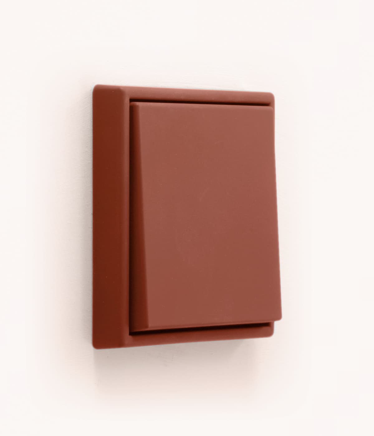
North-facing rooms have a cooler, more natural light, and can often feel cold and dark. It’s often advisable to incorporate warmer colours in these spaces and introduce mirrored surfaces to bounce the light around the room. Extracting from Les Couleurs Le Corbusier, obvious choices to use in North-facing rooms could be 32112 l‘ocre rouge clair, 4320W le jaune vif and 32082 orange pâle.
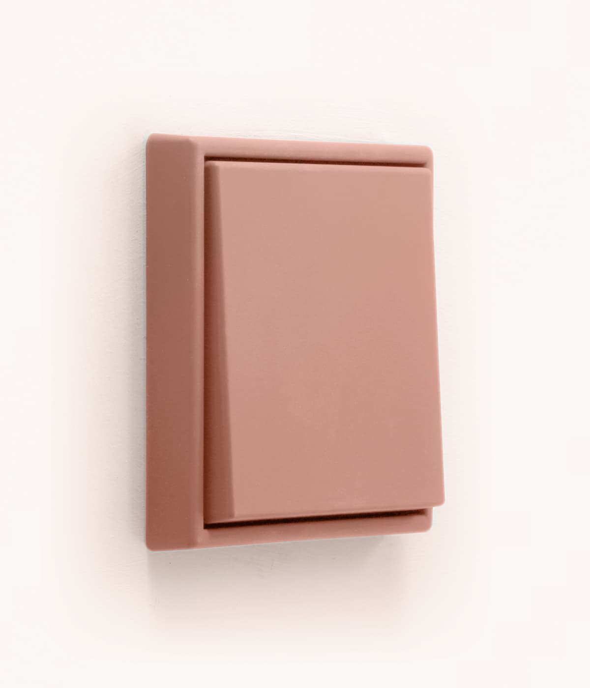
In the mornings, East-facing rooms will have natural light, whereas West-facing rooms will experience natural light in the early evening; these rooms may require artificial lighting during the daytime hours and as such this could distort the true colour. Again, reflecting which of the 63 colours from Les Couleurs would be optimal in an East or West-facing room, hints of blues and greens work well: think 4320F vert olive vif, 32033 céruléen clair, 32013 gris clair 31 and 4320C rose vif.
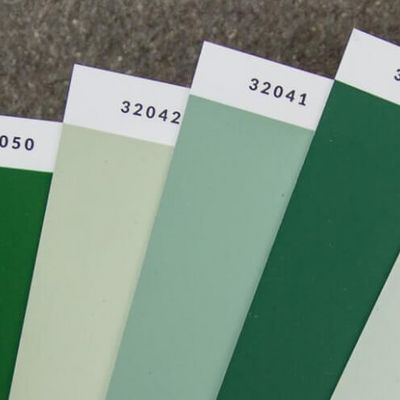
Lastly, South-facing rooms are fortunate enough to enjoy clear strong natural light so all colours work well here. Cool colours will, however, balance the intensity of brightly sunlit rooms, so reflect on using colours such as 32033 céruléen clair, 32024 outremer gris and 32042 vert anglais pâle.
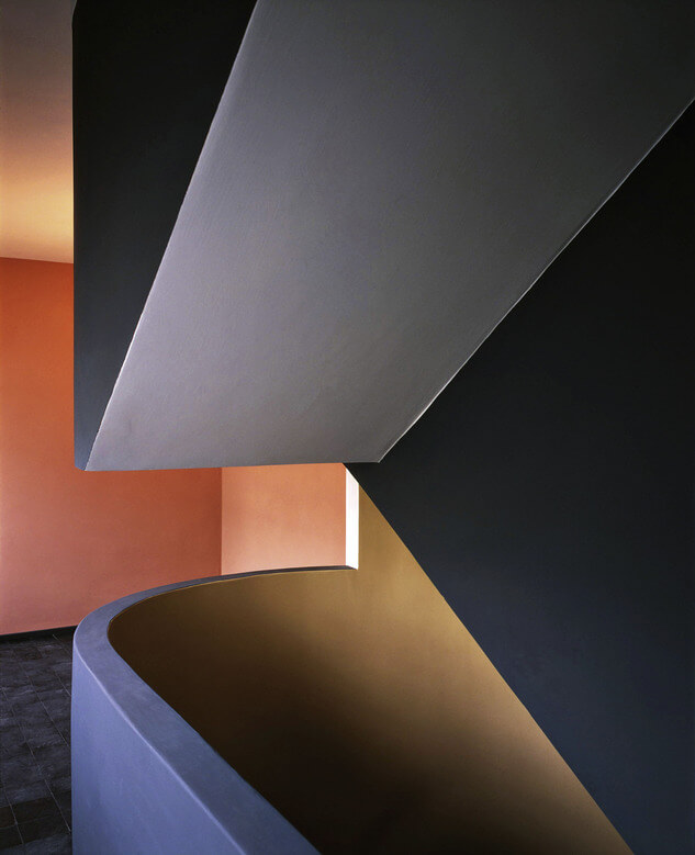
Light creates ambience and feel of a place, as well as the expression of a structure. Le Corbusier
When we talk about light refraction, it is basically the bending of light: it is the change in direction of a wave passing from one medium to another caused by a change in speed - namely as it passes from one transparent substance to another. Light travels slower through glass, which is why a prism can separate all the visible colours because when light hits the prism at an angle the different wave lengths of visible light are slowed down and fan out.
The higher index of refraction means that violet light is the most bent, and red is the least bent because of its lower index of refraction, and all the other colours fall somewhere in between. Science tells us that combining additive primary lights of blue, red and green together creates a white light, yet combining the three primary colours in a paint form creates a brown sludgy mess – which purely underlines the significant role played by light. Remember that when you see a colour, the object you are looking at has actually absorbed every colour except for the one you are seeing. White is of course the absence of colour.
The behaviour of light is so impactful on the overall feel of a space, that using a specialized lighting consultant is a valuable investment for larger projects: if your lighting options haven’t been extensively researched, then the entire project could fail as colours won’t sit as imagined and textures and surfaces will react differently than anticipated at the initial planning stage.




Comments
No Comments