Introducing the Exhibition: Füssli. Mode, Fetisch, Fantasie
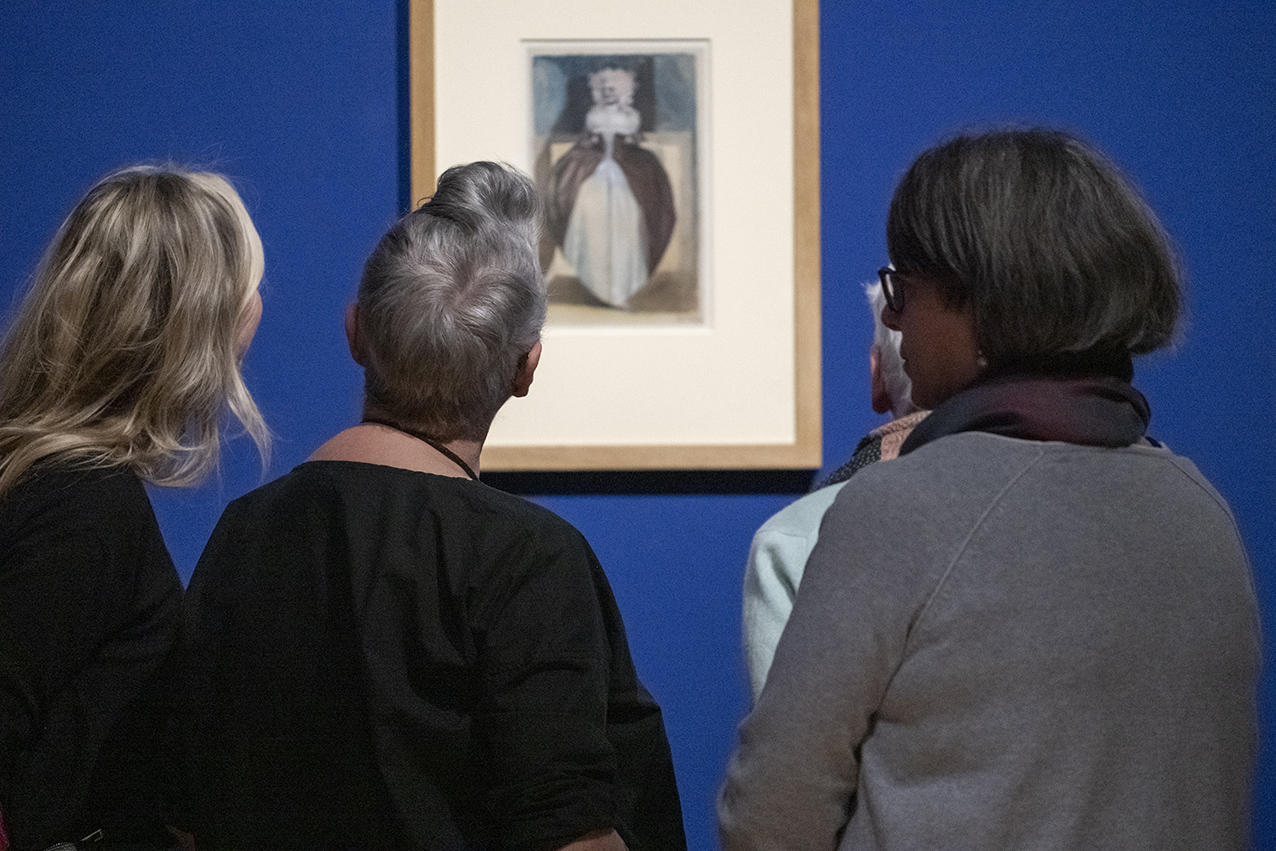
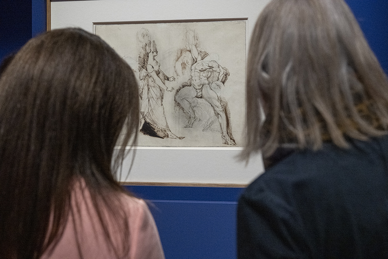
The Füssli Exhibition, currently on display at the Kunsthaus Zürich until 21 May 2023, is a magnificent example of how the use of colour can add depth and intensity to the works of an artist. The exhibition showcases the artist's most artistically elaborate works on paper, featuring a multitude of graphic techniques, including graphite, pen, watercolour, and opaque paint. As a curator, the choice of colour for the walls was crucial to create intimacy and offer visitors a more intense experience in terms of space. Read the full interview with the curator below.
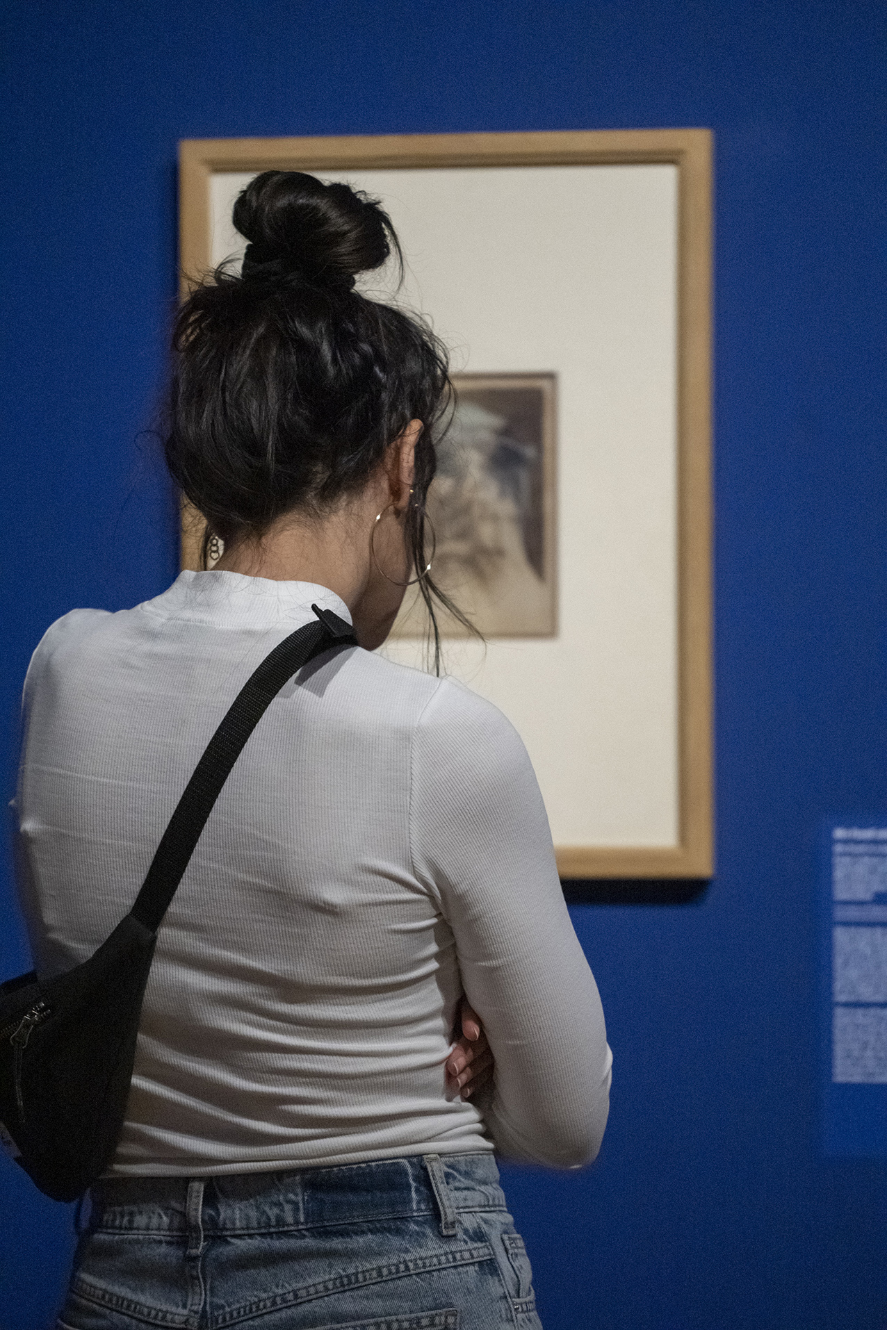
The choice of the Bleu Outremer Foncé colour (4320T – Dark Ultramarine Blue) from Le Corbusier's Architectural Polychromy aims to enhance the exhibition’s drawings by revealing dynamic qualities in them. The goal was to create an environment that would simultaneously "breathe" and awaken visitors’ emotions, as in line with the worlds imagined by Füssli.
Le Corbusier’s Architectural Polychromy, as stated by the curator, is the most vivid colour proposal there is. Every shade on the palette seems to have been carefully considered, making it a reliable and stimulating tool for curators facing spatial issues. The selection of colours has lost none of its relevance to this day, as it provides visual harmony and enhances the architecture's character.
Füssli and Le Corbusier’s connection as two visionary artists born in Switzerland and dying abroad is a significant detail within the exhibition. Reuniting these two great masters seems perfectly natural, and the choice of colour 4320T provides a depth and richness that is in line with Füssli’s elaborate works.
An exclusive interview with Jonas Beyer, Kunsthaus Zürich
Exposition "Füssli. Mode, Fetisch, Fantasie" (21.02-21.05.2023) Application wall paint 4320T Bleu Outremer Foncé/ Polychromie Architecturale/Le Corbusier
Interview with Les Couleurs®Le Corbusier (Mana Bättig, LCS) and Dr. Jonas Beyer (Curator, JB) about the reasons and importance of selecting Le Corbusier’s Colour 4320T Bleu Outremer Foncé as the background colour of the exhibition room.
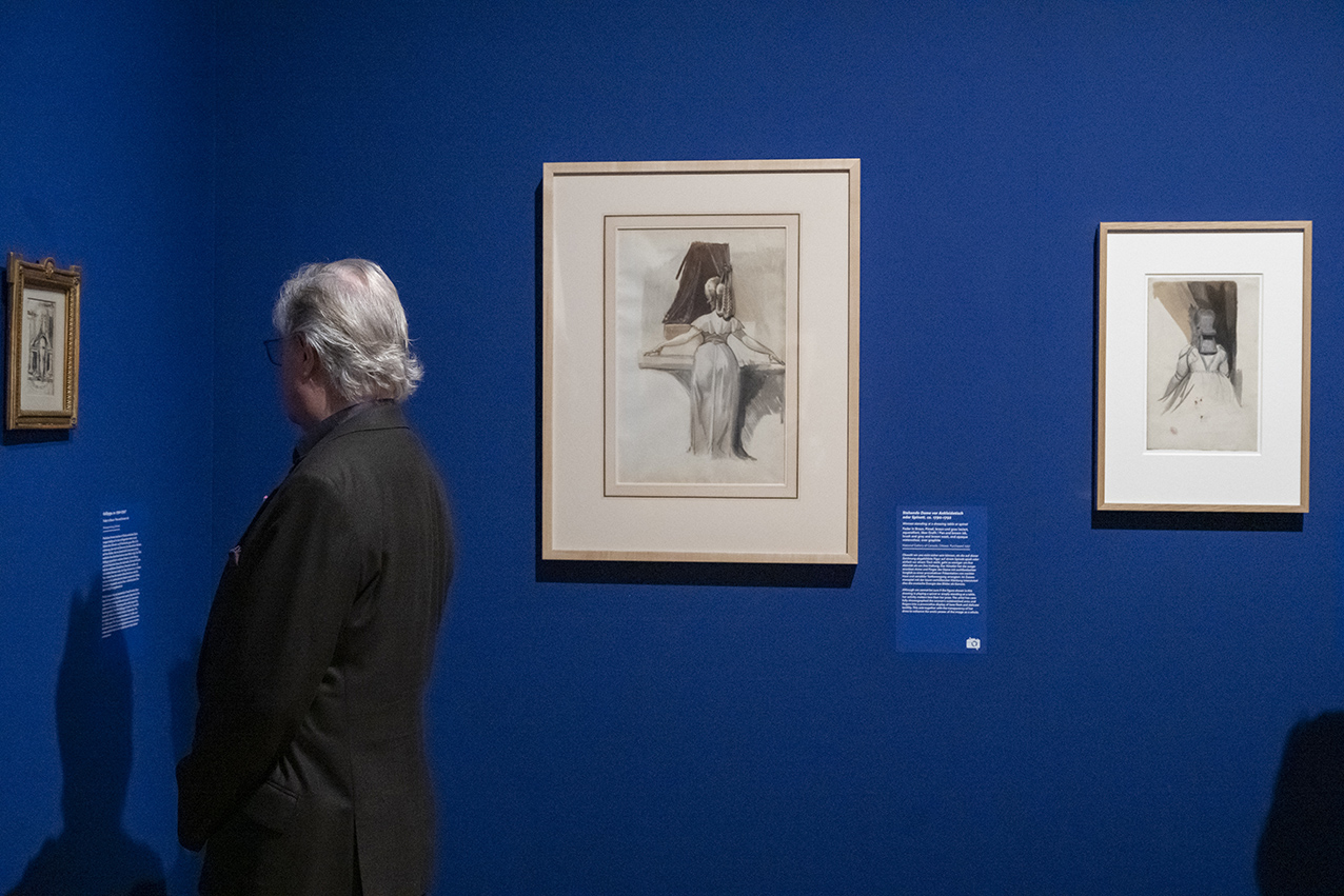
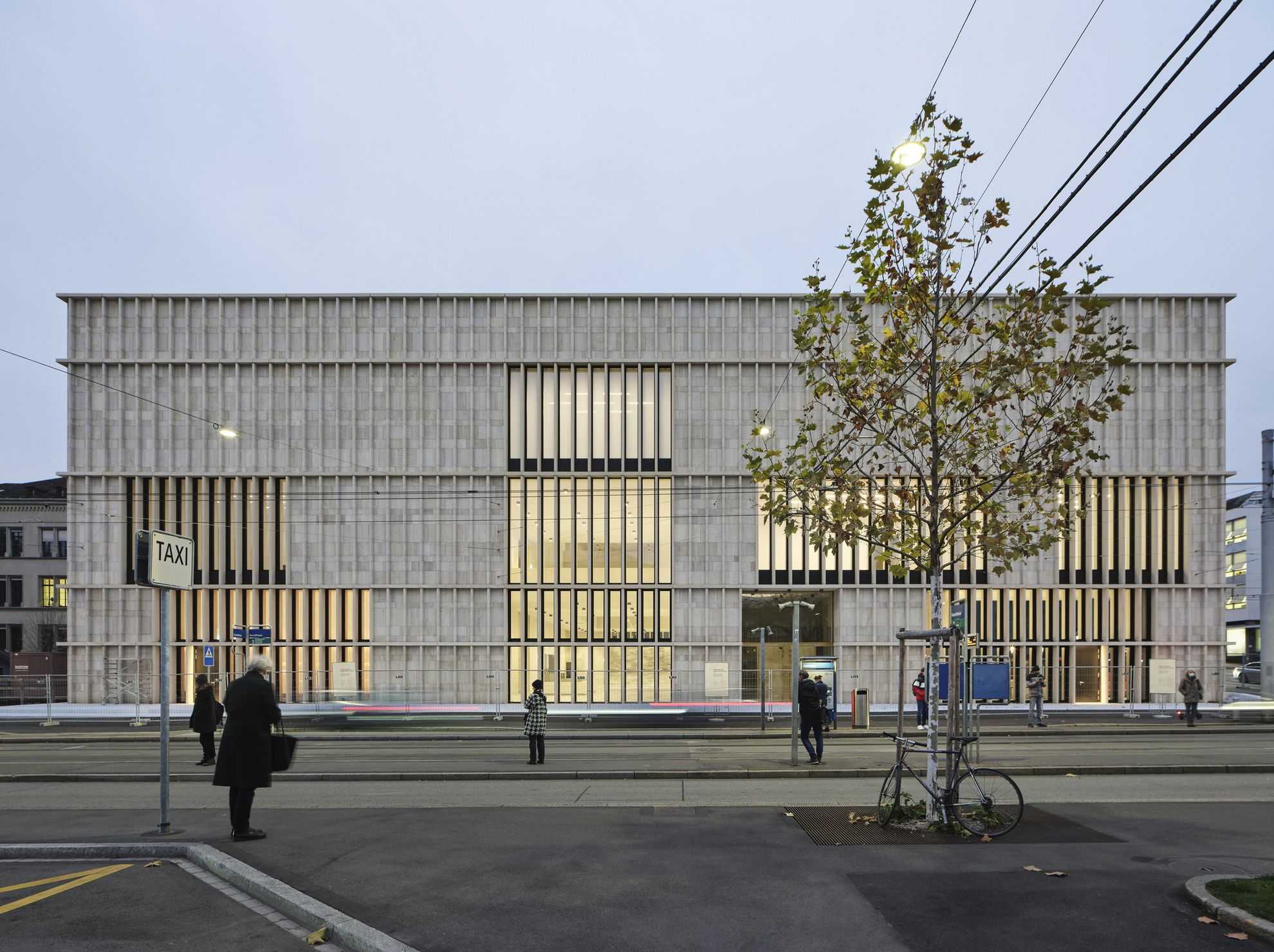
Image © Caroline Minjolle Kunsthaus Zürich, Chipperfield-Bau with works from private collections, the National Gallery of Canada, Ottawa, and the Kunsthaus Zürich
LCS: Le Corbusier’s Architectural Polychromy is timeless. In his works, Füssli gives shape to visions. For this exhibition, Füssli’s paintings have been highlighted and enhanced by choosing the Bleu Outremer Foncé colour (4320T – Dark Ultramarine Blue, which dynamises elements around, and is also a symbol of infinity) as the background colour. What message do we want to convey to the visitors by associating Füssli’s works with this 4320T blue?
JB: As an exhibition curator, it was important to me that the colour of the walls awakens deep feelings in visitors. In line with the worlds imagined and painted by Füssli, the surrounding area also had to "breathe", and this can be made by choosing the right colours. The goal was to offer visitors a larger experience in terms of space.
LCS: "Polychromy is the most living thing there is, and also the most current", says Le Corbusier. How can the polychromy in painting – in other words, Füssli’s own pictorial complexity - and Le Corbusier’s great invention – that is, the Architectural Polychromy - be compared from an artistical point of view?
JB: Füssli’s drawings featured in our exhibition are among his most artistically elaborate works on paper. A multitude of graphic techniques are used here: graphite, pen, watercolour, opaque paint.
This complexity found in the details demands that the colour of the walls provide some sort of answer. If we had exhibited these paintings in a sort of white cube, the effect produced by these works would certainly have been much less intense.
LCS: Just like Le Corbusier, Füssli was born in Switzerland and died abroad. This is another detail that brings these two visionary artists together. Did you choose the 4320T colour consciously and for a specific reason? If so, what were you looking for through this colour?
JB: I think everyone in Switzerland feels a certain closeness to both Le Corbusier and Füssli, so reuniting these two great masters was, in a way, the most natural thing. On the subject of colour, I’ve often found in my work as a curator that drawings from older artistic eras look particularly good against a blue background, especially when the colour is rich and has a real depth. And the blue proposed here by Le Corbusier adds something essential to the overall artistic experience, given that the colour of the wall acts as a neutral support, while also revealing dynamic qualities in some way.
LCS: In three sentences, what can you say about Le Corbusier’s Architectural Polychromy?
JB: Every shade on the palette seems to have been carefully considered. For curators, who are often facing spatial issues, this selection is a very stimulating and reliable working tool. This careful selection of colours has certainly lost none of its relevance to this day.