Apartment 258 – The three-dimensional painting in the Berlin living machine
The 53-meter-high concrete building towers are high above the trees of Berlin's Charlottenburg district. It is the Unité d'Habitation type Berlin, which Le Corbusier designed in 1957 as part of the International Building Exhibition. During the construction phase, he had to deal with the House of Representatives of Berlin in many discussions, since in their opinion, a violation of the German building code was taking place. Therefore, Le Corbusier's living machine in Berlin was not finished according to the original plans and is different from its French sisters, which Le Corbusier built under the rules of his ‹5 points of a new architecture›. But the architect Philipp Mohr managed what Le Corbusier could never complete and realised the original plans of the great architect in an apartment of the Berlin Unité.
The Apartment 258 is located at Flatowallee 16, on the southern end of the Corbusierhaus. It is a two-room-kitchen-bathroom-maisonette apartment. When Philipp Mohr looked around for purchase and investment real estate in Berlin, he found the apartment purely coincidental. Since he visited Le Corbusier exhibitions as a child, his interest in his architectural aesthetics had awakened early on. «My life has been full of questions about modernism, and my passion has always been to make the modern tolerable and habitable. Throughout my life, I found dislike when historic buildings have been modernised or supplemented with extensions. I knew about the tragic history of the Corbusierhaus and that Le Corbusier could not complete the interior of the building exactly as he wished.» Philipp Mohr also acquired the apartment because of this challenge, with the ambition to restore it to its original condition. He tried to proceed as detailed as possible.


Mohr began his research in the archive of the Fondation Le Corbusier in Paris, where he studied Le Corbusier's notes to the various living machines. He found original designs and based his obtained information on intensive research at the Unité d'Habitation in Marseille, where he lived temporarily. By visiting comparative apartments in Nantes-Rezé, Marseille, Firminy and Briey, he gained a deeper understanding of the intention behind Le Corbusier's architectural system. « I have visited some original apartments to see the effect and the interlocked apartments are really ingenious! Le Corbusier has been working for a long time to find the perfect solution for high rise apartments. The most important effect of the two floors is the high living space at the window. In later residential buildings, for example in Berlin, this double room height was not built anymore. This is a fundamental flaw in the development of modernity. Any architect who wants to plan modern today should visit and study the Unité building in Marseille, it is indeed a model example of social housing at a very high level and with many future-orientated ideas. »
When he bought the apartment, Philipp Mohr found the original 1958 interior. Everything was completely white and looked like a prison or a typical German social housing. Nothing was like Le Corbusier would ever design it, he says. Through research, Philipp Mohr learned that German architects had to design their own interior, which was also cheaper to produce. The result is, according to Mohr, no longer proportional, so the whole character, the feeling as well as the quality and function have been lost. After the entire interior had been gutted, Mohr lowered the ceiling height of 2.50 m to the originally planned 2.26 m, a modulor measure. Furthermore, his plan was to reposition walls to reproduce the original floor plan. Mohr finds it a pity that the Berlin Senate decided against the gallery to gain more square meters. «The special thing about the double room height and the gallery is that you get the feeling to live in a spacious house. You cannot describe living space, not in pictures, plans, cuts or anything else. Unfortunately, living conditions can neither be described nor argued, » says the architect. The ceiling opening, which should provide the apartment, as in the original, with a lofty gallery, was not approved by the owner community... It almost seems as if the story would repeat itself.
Through extensive practical experience in the USA, Philipp Mohr has learned to assimilate building styles, which helped him with the reconstruction of the apartment in Berlin. Using his knowledge of the Modulor dimensions and his studies of the originals, he was able to reconstruct the details of the kitchen, windows, cupboards and staircase. Mohr bought individual original parts of a kitchen from an apartment in Marseille and reconstructed the missing pieces based on the original plans. What benefited him: the dimensions in the UH Berlin had all been changed very much, only in the southern part had the width of the apartments been kept to their original size. That is why an original kitchen exactly fits in the Berlin apartment. Elements such as lamps and furniture were selected looking at photographs of the model apartment from 1952. Mohr went to Paris, Berlin, Marseille and online in search of original and authentic furniture. This is finally reflected in the apartment: a harmonious combination of originals (including Charlotte Perriand's swiveling wall lamps and table lamps) and furniture made under license (such as metal chairs by Jean Prouvé and Pierre Jeanneret / Cassina).
Colour and architecture – a three-dimensional painting
Philipp Mohr is convinced by the fact that colour and form are the basic building blocks of architecture. In his opinion, however, a lot has been problematised in today's modern times: «In the 70s, people used exuberant colour on wallpapers and curtains, for example. In the '80s, people did not dare to use colour anymore and since then there is no global colour concept anymore. » But Le Corbusier’s colour and architecture are one and only thing: the building and its rooms are a three-dimensional painting and the colouring is the guide, Mohr found out in writings of the Fondation Le Corbusier. Hence, he took a very close look at the choice of the colour concept and compared the wall colours in different Unités with the help of the colour fan and the volumes on the Architectural Polychromy by Arthur Rüegg. He was able to obtain colour samples from the museum apartment at Le Corbusierhouse in Marseille. He was also helped by the replica of a Marseille Unité apartment in Paris' Cité de l'architecture & du Patrimoine museum designed by Pascal Mory, who also spent a long time reconstructing the colours and apartment architecture. The fact that Philipp Mohr himself lived in the apartment before the renovation helped him a lot with the choice of colours, as he could look at the different daylight situations in the apartment. "Light has a great influence on form and colour," says the architect. It was a big step forward when he came across the colours of the Architectural Polychromy. Mohr began using the colour keyboard of 1931 to select the appropriate colours, but only the installation of the original kitchen gave him the necessary self-confidence. Based on the colours of the kitchen, he now combined the colours and finally chose the atmosphere ‹Velvet›. Mohr finds that this is also reflected in the character of the apartment with its velvety surfaces and materials, furniture and fabrics.
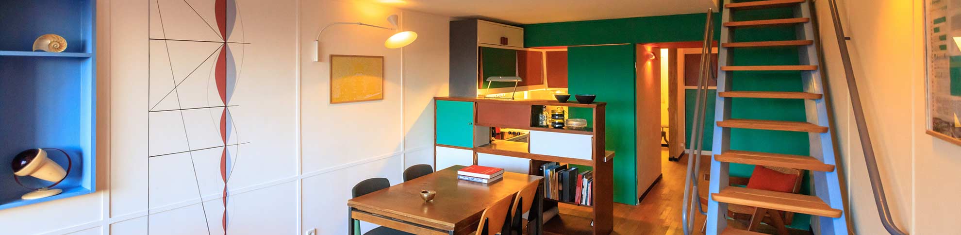
The architect started observing a basic principle: the interior must consist of rectangular areas. He also took up Le Corbusier's idea that strong colours are used as accents in smaller areas (such as the blue shelf in the living room), while soft colours dominate the large areas and thus get in the background. For the walls of the lower floor, Mohr opted for the pure white 4320B blanc ivoire and the cream white 32001 blanc for the east wall. On the upper floor, he painted the west wall in 32121 terre sienne brique, which picked up the Sienna of the loggia. The green of the loggia wall was continued in the kitchen. «It seemed to make sense to use the same colours inside to create a bridge between inside and outside. Now I had my basic colours ».


In the entrance area, the beholder immediately notices the red ceiling (32090 rouge vermillon 31), which extends to the small room opposite to the front door. The mural there is strongly reminiscent of Le Corbusier's cubic art – a homage to the architect. The professionally reconstructed built-in cupboard is based on the original colour combination from the Unité in Marseille and shows contrasting colours such as green, brown (32120 terre sienne brûlée) and red. This colour combination is also continued throughout the kitchen, contrasting the colours here with clear white and natural wood. The 32040 vert anglais of the kitchen can also be found on the wall behind it, repeating the green of the loggia. The airy staircase to the upper floor was deliberately painted in 32021 outremer moyen, a colour that represents the sky and can be combined with almost any colour. In order to create a balance in the room, the architect decided to paint the shelf, which had been let into the wall, in the same tone. Entering the upper floor of the apartment, the visitor is greeted by a large window front, which is extended to the floor by a heater in 4320W le jaune vif. On the walls, the 32001 blanc continues from the lower floor, while on the opposite wall the bright brick red of the loggia with 32121 terre sienne brique is extended into the room. The bathroom experiences a relatively unimpressive colour design compared to the rest of the apartment: 4320B blanc ivoire, the ceiling in the airy 32021 outremer moyen and some surfaces in 32011 gris 31. Mohr set accents here: a ceiling strip and the oval door to the shower are kept in soft, restrained 32042 vert anglais pâle and the doorframe to the bathroom glows in radiant 4320S orange vif. The skirting boards and window frames have also benefited from Le Corbusier's Architectural Polychromy and have a dark, brown-gray 32140 ombre naturelle 31 finish, like a frame between the floor and the walls.
The architect was surprised when he saw the final result of his colour design. He would have never thought about these colour constellations before and he thinks they are definitely the result of two years of intense engagement with Le Corbusier, with his records and his buildings. Mohr talks about his experience with the painting of the railing: «I had already tried beige, white and black, but was not satisfied. Then I read in Le Corbusier's notes that, in addition to white and black, he considered only grey to be a suitable colour for metal. That’s why I painted the railing in a dark grey, which created a very nice colour mood on the stairwell: the creamy white in the background, the blue of the stairs, the grey of the railing and the green wall on the head wall. Additionally, the clear white on the ceiling – for me that was a revelation actually! The combination of rich pigments and rough colour on the walls as well as smooth colours on wood and metal gave the interior an incredible vibrancy and harmony! » According to the architect, colour is the second most important element in the Unité apartment, as the architecture begins to live by using colour. «Le Corbusier's idea of the interplay of colours and forms is a total work of art! Everything is perfectly put together so that the resident does not have to change anything anymore. These classic colours are timeless, inviting and so dynamic in the apartment! It always fascinates me that the apartment does not look old-fashioned. Through the use of wood and other natural surfaces, the apartment feels cozy and the proportions of angle and light are encouraging ».
Design principle of daylight
When it comes to architectural colour design, Philipp Mohr always follows a principle: «I start with white-painted walls. Then I paint rectangles of the same colour on all walls and observe them in different daylight situations. It's always important to study the light in the room to know where the sun's impact hits colour and brings it to life.» When designing with colour, you should also be aware that a bold colour looks quite different opposite of a window than in a dark corner. Another tip: if a white or cream-coloured surface should look particularly vivid, this can be achieved with a light brush structure.
«Modulor-dimensions, light and shape, form and function, the open floor plan, materials and colours, I could try all of that and learn from Le Corbusier. » Mohr finds that one can sense that Le Corbusier originally came from painting. «He incorporated much of his inner artist into his architecture. In this way, he was able to create the bridge between colour and architecture, creating a series of classically modern colours, which act as absolute and ideal on humans.» That's why Mohr decided to use the original Les Couleurs® Le Corbusier colours, which are distributed by the company KEIMFARBEN. "The beauty of KEIM colours is that all of its ingredients are natural and mineral. This can be seen directly when standing in front of the painted surface, as the light is absorbed and the colour is properly radiated. "
The German-American architect and designer Philipp Mohr has offices in New York and Berlin. With his team, he designs i.a. living concepts and designs for stores such as BMW, Louis Vuitton or Samsung. Due to his meticulous reproduction work in the Apartment 258 in Berlin, Mohr was nominated for the Dezeen Award 2018 in the area ‘Residential Design’. After completion, the apartment including the interior was sold to a couple, which claims to be «completely in love» with the apartment.
Read more articles about the Unité d'habitation type Berlin:
Le Corbusier’s residential unit ‹Type Berlin› – a dialogue between building, people and colour
The Colours of the Collective – Colour application in collective housing
Photography Copyright
©Didier Gaillard
©Rainer Gollmer
Plans and sketches
©Philipp Mohr Design