Colour rave – Le Corbusier's Architectural Polychromy in the design hotel Miramonte
From the outside, the unadorned 1960’s style of the Hotel Miramonte in the Austrian town of Bad Gastein is rather inconspicuous. Inside, however, the guest is literally overwhelmed by a rave of colour. After the acquisition, the owners wanted to consciously get the charm of the 60’s and not completely change the hotel. So they decided on a concept that maintains and reinforces the unmistakable character of the hotel through the mix of old and new.
The owner, Mr Ikrath, commissioned colour designer Ernst Muthwill for the design and implementation. He describes the first step in finding a concept: "One should always take the existing potential and integrate it into the new concept. Something that has quality and has been enduring for decades should be appreciated and put in the right light. One supplements the old and tries to reconcile it with the present time.” First, he and his team checked the inventory in the interior. In this case, there were wood fixtures and a black-green stone floor, as well as wooden floors, which were also refurbished in the course of the renovation. The important thing about the inventory, however, is that you have to build on the existing colour. The design process in the team is very important to him, because he is convinced that you can see through multiple sensory impressions of different experts, the big picture. The colour designer was not primarily concerned with the individual hue, but with the created atmosphere. This was also an important point for the owners: hospitality! With the individual colour design of each room, they wanted to welcome the guests with colour. Through his profession as an architect, Mr Ikrath is familiar with the architectural colours of Le Corbusier and wanted to experiment with them and realise them in his hotel. He was convinced by the extraordinary colour intensity and depth of the mineral wall paint by KEIM, one of two licensed manufacturers of Architectural Polychromy. The Swiss manufacturer KABE (Karl Bubenhofer AG) produces the original architectural colours of Le Corbusier as emulsion paints and lacquers.


In a colour rave with Le Corbusier's Architectural Polychromy
In the colour design of a hotel, you always have more freedom than in private rooms, so Mr Muthwill. The team advised on what they could do to complement the situation, giving the room a comfortable feel and using the full potential. Because a colour never stands alone, but always interacts with the others – thereby they change the space together. Through reflection, suggestions and objections from the entire team, the colour design was further developed and changed until the right colour concept was found. For example, they decided to use light grey or blue in small rooms to make the room look bigger. The spa town is known for its thermal waters, hence the reference to the old healing power of the water of the surrounding area should be created in the yoga room: the grey-blue reinforces by the colour, the stone floor and the wood do so by their material. The existing wood, as well as the dark stone floor throughout the house, fit all the chosen colours in the concept, says the colour designer.
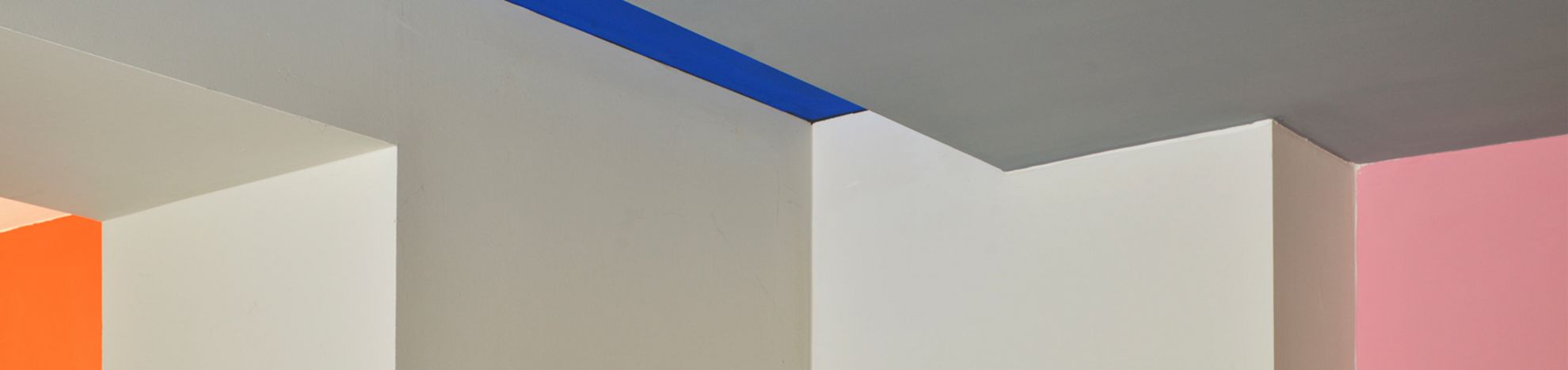
In the entrance area, the guest is greeted by the colours in deep ultramarine blue, the 4230T bleu outremer foncé, the 4320N bleu outremer 59 and the luminous 32031 céruléen vif. The dining room features the energetic 4320S orange vif, complemented by the luminous 4320Crose vif and stabilised by the delicate, bright blue-green nuances of the 32034 céruléen pâle, as well as the 32032 céruléen moyen and the ultramarine 4320K bleu outremer 59. The bar, with a partition in ultramarine, is atmospheric in its colour combination of 32090 rouge vermillon 31, the bright, dynamic cinnabar red, 4320L ocre jaune claire (a deep and warm colour) and the soft, restrained 32019 rose pâle.
Colour is the zest for life
With the help of the Le Corbusier colour fan, it was not hard to choose suitable nuances from the 63 colours of the Polychromie Architecturale. Ersnt Muthwill likes the fact that a frame is given, they are kind of 'pre-sorted'. "Nowadays, there are infinite colours, but unfortunately also infinite possibilities to grab them completely wrong. Le Corbusier's colours prove that they are both classic and timeless, modern and always harmoniously combinable. Even when fabrics and other materials are added, the colours match perfectly to anything!” Through his experience as an artist, Mr. Muthwill has had similar experiences just like Le Corbusier. This helps him to visualise the potential of a room. For him, the value of colour is obvious: "Colour is the zest for life, you just have to choose it with your heart!"
Photography Copyright
©KEIM