Le Corbusier’s Colour Keyboards
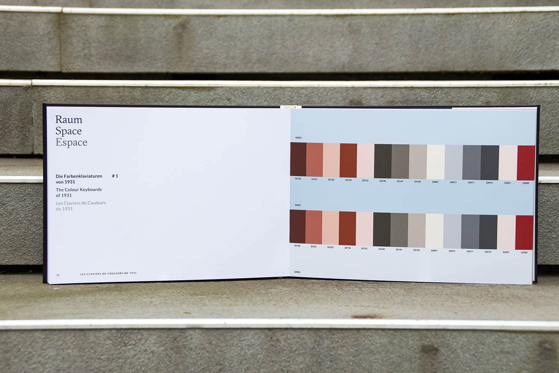
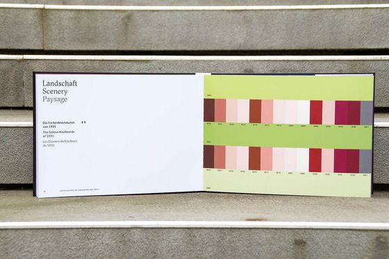
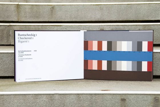
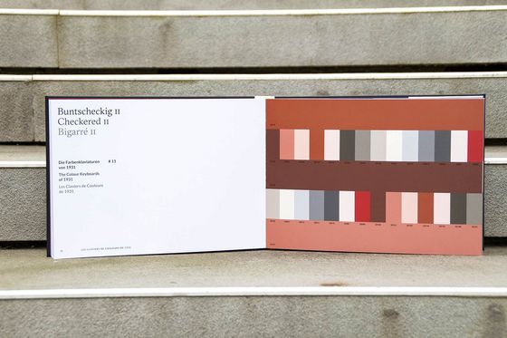
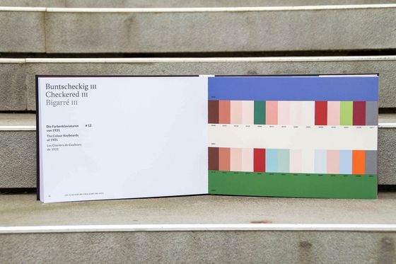
To support the polychromatic colour design, Le Corbusier developed, based on his 63 architectural colours, the famous colour keyboards – 13 different atmospheres, each of them with specific spatial effects.
Our new book "The Colour Keyboards - Le Corbusier's Architectural Polychromy" authentically reproduces Le Corbusier's Colour Keyboards and quotes from his typeface "Architectural Polychromy – Study by an architect (by the way also involved in the adventure of contemporary painting) for architects". On 44 pages the book presents 63 colours on a total of 13 colour keyboards and includes the "Glasses" on two separate slides. The colour keyboards were produced in high-quality 4-colour printing.
„ [ ... ] I think, that with these plates a great variety of choice can be offered spontaneously. If one found oneself overwhelmed by the influx of 31 juxtapositions offered within each plate, the two glasses that accompany the collection allow isolating either two tones on the background nuances, or three tones. By superposition of the two glasses, one will also be able to isolate a single tone on two background nuances. As a result, the choice can definitely be rendered more precise.”
Le Corbusier
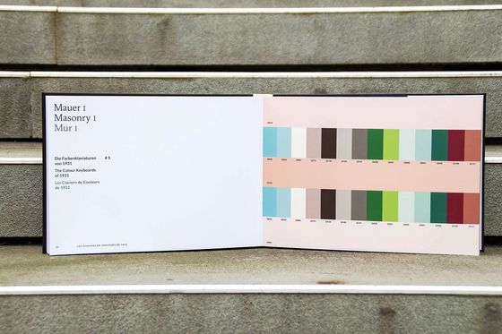
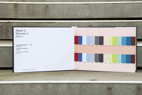
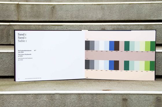
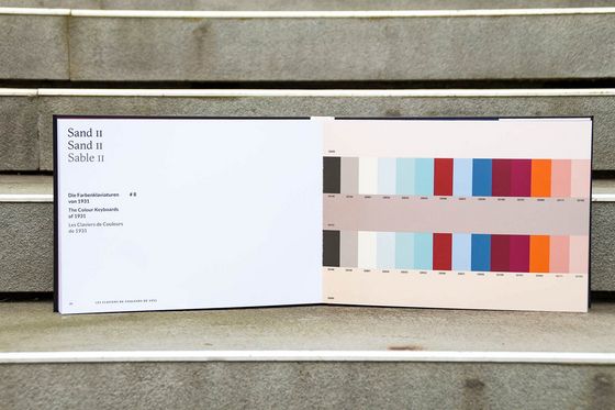
The Colour Keyboards of 1931
Le Corbusier's first colour palette consists of 43 shades. Along with them, he developed nine colour atmospheres, each with three colour nuances and selected colours to combine with. The colour shades are systematically arranged so that the collection accompanying glasses allow two or three shades to be isolated on the background nuances as well as a single tone on two background nuances. He designates every atmosphere with a name that corresponds to the polychromatic function.
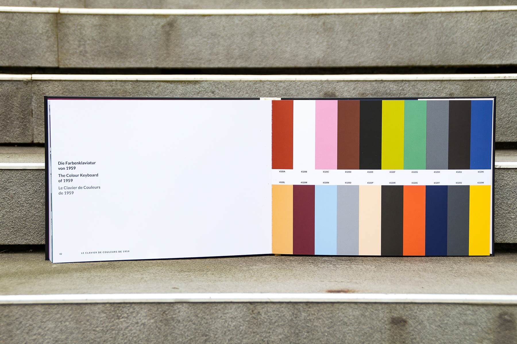
The Colour Keyboards of 1959
From the 20 colours of the second collection, Le Corbusier developed an additional colour keyboard, which offers numerous other possibilities of colour combinations. Three or four colours can be isolated and combined with the supplied glasses. All 20 colours from 1959 can also be integrated harmoniously into the atmospheres of 1931.

Dr.Hildegard Kalthegener
Colour expert and designer
Le Corbusier’s Architectural Polychromy
Colour expert and designer Dr. Hildegard Kalthegener, who gives lectures about colour at various trade fairs, works with Le Corbusier's colour keyboards and is firmly convinced by the colour effect: "The different colour combinations can create an atmosphere that goes far beyond functionality. The Architectural Polychromy is unique in its kind, as one can create unusual, but always harmonious constellations. I was really surprised how numerous the possible combinations are. Le Corbusier's colour repertoire includes soft tones as well as luminous, deep nuances – with a historical, artistic and associative background. They all express an inner consistency that makes disharmonic compositions almost impossible."
As an experienced expert of colour design, Dr. Kalthegener sees the success of the architectural colours by Le Corbusier in the fact that they are not tailored to a period: "After more than 80 years, the colours Le Corbusier created are still timeless in their effect, you can almost say trend-resistant! he reduction to 63 colours is another great advantage that allows you to create innumerous possibilities of exciting colour combinations from a limited range. I think the colours are the common thread of a man who expressed his creativity not only through architecture, but also as an artist with his painting – the bridge between painting and architecture is the Architectural Polychromy."
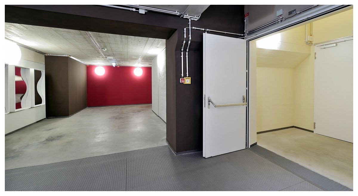
Colour Keyboards in practical use
With the help of Le Corbusier's colour keyboards, the team of Les Couleurs Suisse created a colour design in the international flagship store of KARE Design in the former cogeneration plant in Munich. The stairwell with its five floors was designed in 21 colours by putting the colour keyboards into practice. On the top floor we find:
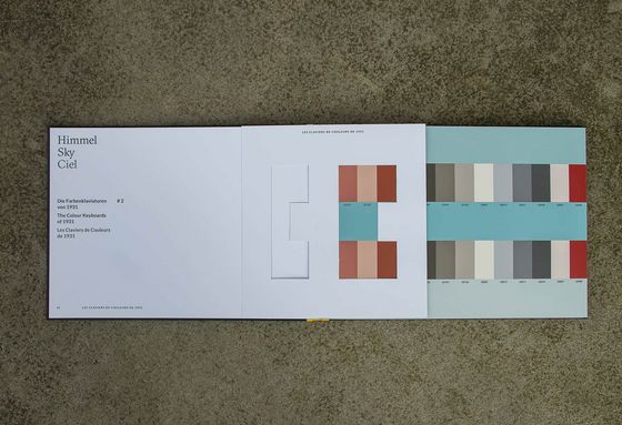
Sky
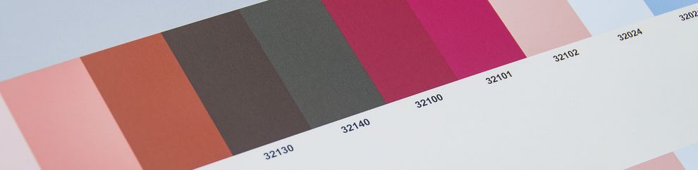
The atmosphere of sky is created by the colours 32032 céruleéen moyen and 32033 céruleéen clair. The first atmosphere in Le Corbusier's colour keyboards further includes 32090 rouge vermillon 31, 32091 rose pâle and 32010 gris foncé. The characteristic 4320W le jaune vif from the second collection embodies the yellow colour of the sun.

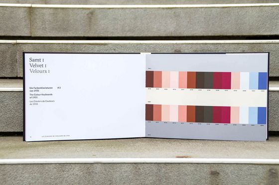
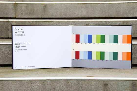
Samt
The mood velvet is created by the shades 32013 gris clair 31 and 32001 blanc. 32130 terre d'ombre brûlée 31 and 32101 rouge rubia are used as combination colours.
Order here "The Colour Keyboards - Le Corbusier's Architectural Polychromy" and find a unique colour design for your next project!