The Colours of the Collective
On the subject of Le Corbusier's colour design in collective housing, Les Couleurs® Le Corbusier speaks with the French architect and architectural historian Pascal Mory as well as with Fabian Hörmann, associate in the renowned architectural office EM2N and project manager for the implementation of the complex urban model for the exhibition "Together! The new architecture of the collective" at the Vitra Design Museum. The possibilities offered by colour in architecture are discussed by both experts.
Colour application in collective housing
An impressive example of the deliberate use of colour on façades is the housing development "Cité Frugès" in Pessac, France, built by Le Corbusier in the years 1924-1926. The challenge of the Cité Frugès: 51 houses in reinforced concrete placed extremely dense. Le Corbusier notes:
"[...] The cement plaster are of an unbearable sadness. It meant making use of colour to give appeal and mainly to distance each house, one from the other, to open perspectives, to break the grip of too close walls."
He breaks the yard of a group of houses with a blue colour; the barrier of houses then collapses towards the horizon. In order to intensify the effect, he leaves the two lateral sides of the enclosure fixed by dark burnt sienna. On the opposite side, two houses block the view of the pine forest. Le Corbusier used pale green and notes:"[…] They disappear softly, binding their fate to the green cluster of pines."

Le Corbusier’s colour concept on the example of the Unité d’Habitation
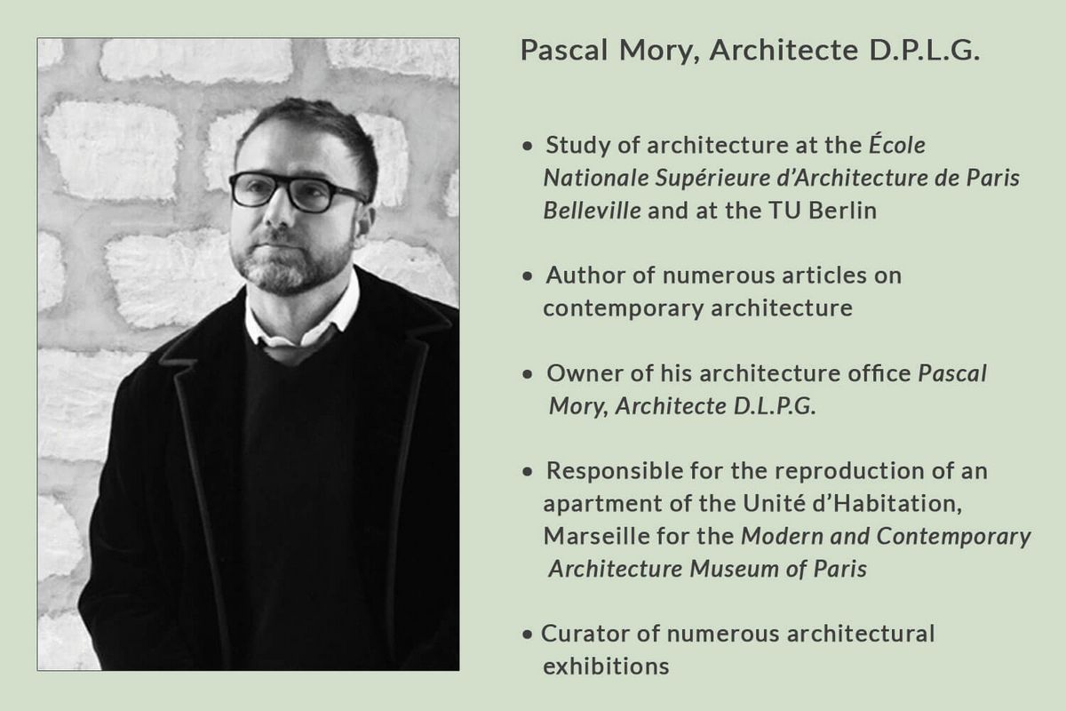
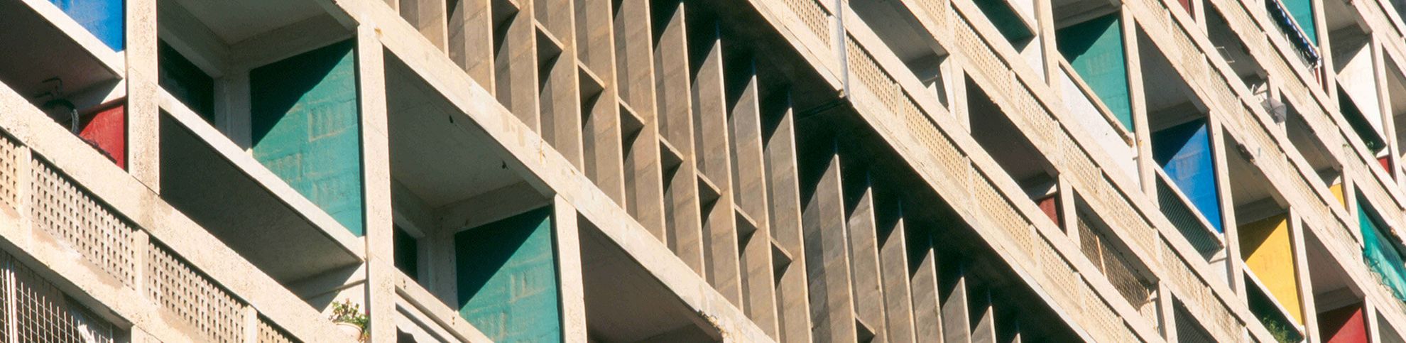
With the Unité d'Habitation in Marseille, the foundation of architectural brutalism, Le Corbusier creates a balance between individual and collective needs and replaces the city – with over 300 apartments, various shops, a hotel and an accessible roof top, which offers a kindergarten, an open- air theater as well as a sports hall. "The post-war architecture of Le Corbusier is characterised by a vivid colour scheme - often as colour accents. The "Béton Brut", the raw concrete, plays an important role in the combination with colour as well. With the Unité d'Habitation, Le Corbusier created one of his most important and well-known buildings in terms of colouring”, says Pascal Mory. Furthermore, he explains that it was nonstandard to paint concrete with colour since the many pores in the structure require a multiple paint coat to give the result a depth. Mory suggests that Le Corbusier was the first to combine colour and Béton Brut.
"Le Corbusier has designed numerous sketch studies on making groups of loggias by using colours - the Brise Soleil; he sought for a designed equilibrium of the elements, the "équilibre coloré". In addition to decorative reasons, the individual connection of the cell-like structure is made visible”, explains Pascal Mory. "The contrast between the vivid colours and the gray concrete makes the dull façade come alive. In my opinion, the building has a great architectural value through the entire colour scheme!"
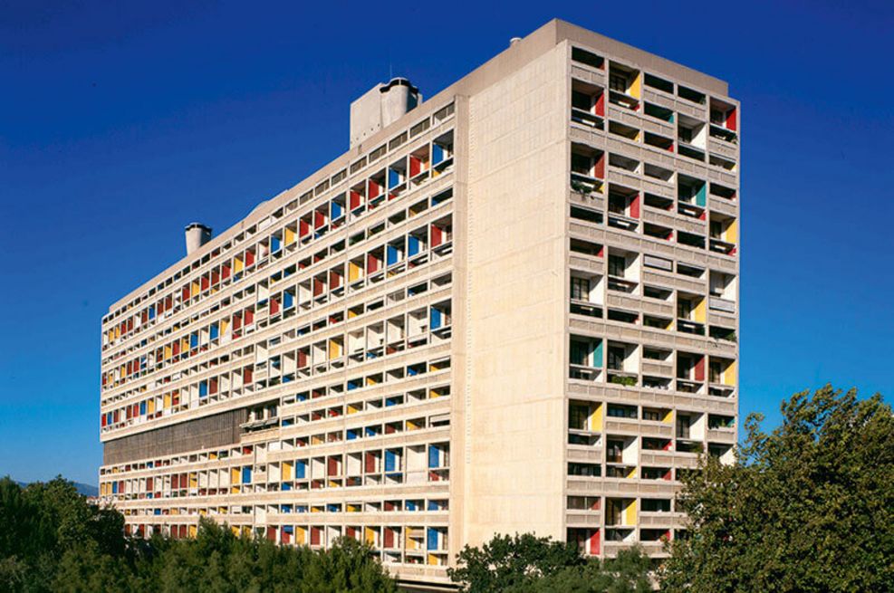
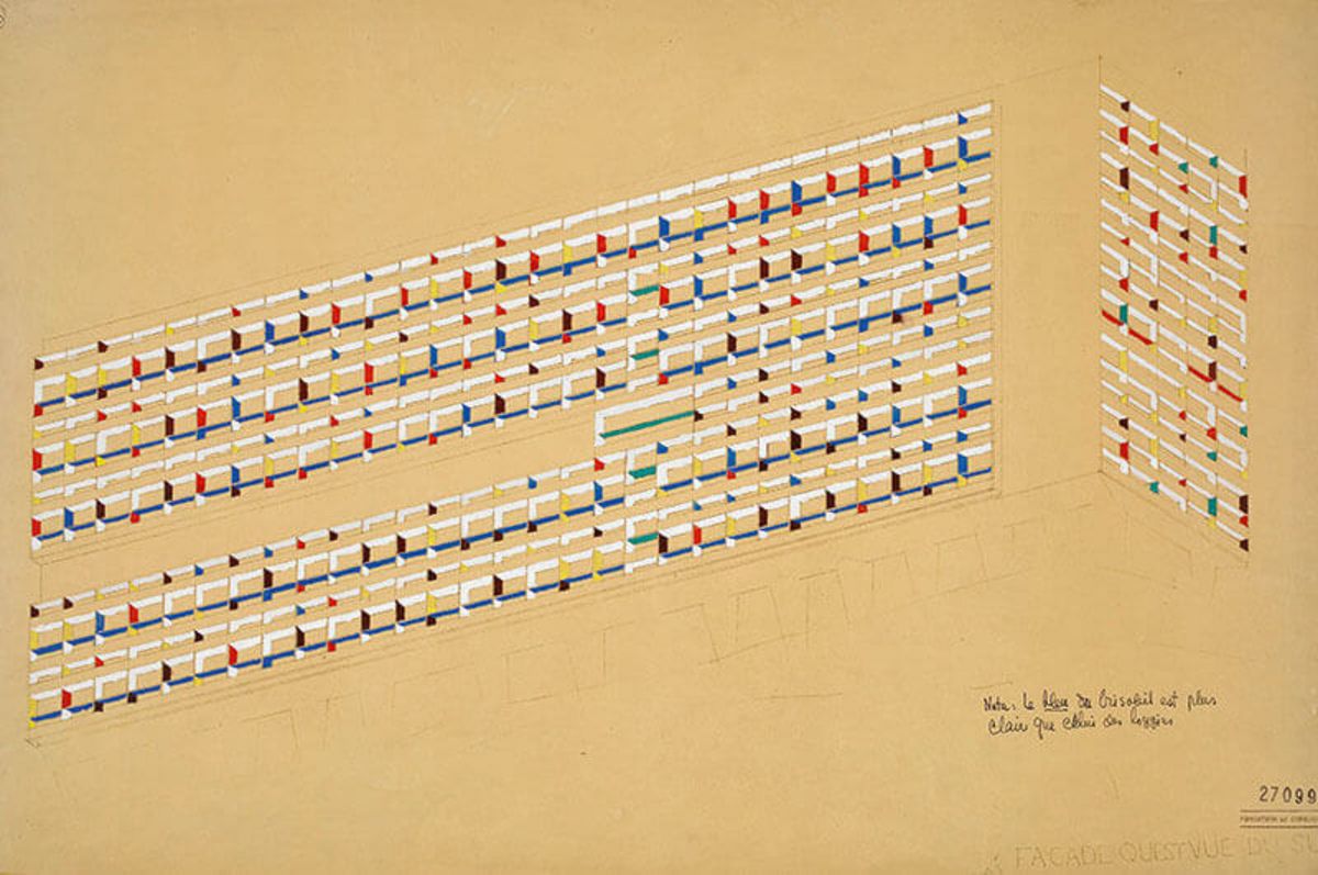
Unité d‘Habitation, Marseille, France, 1945. ©FLC/ADAGP
"[…] he (Le Corbusier) sought for a designed equilibrium of the elements, the «équilibre coloré»."
– Pascal Mory –
Le Corbusier also used the effect of his colours in the interior of the Unité d'Habitation – multiple shades individualise the entrance doors of the apartments, various coloured elements characterise wall units and kitchens, parts of the kitchen cabinets appear as a material mix of wood and colour. Le Corbusier probably used six colours on the façade and inside the Unité.
Pascal Mory, who carried out a comprehensive study in the building for the reproduction of the Unité apartment, explained that in the kitchen mostly green, blue or gray was combined with the brown wood. The built-in wall niche in the big living room was often held in blue according to the recording.
"Unfortunately, there are hardly any theoretical papers by Le Corbusier in which he maintains the colour composition and the colour combination. Over the decades, the inhabitants have painted over the colours, which made it very difficult for us to recreate the original colour combination. But there are also a handful of residents, who have not changed the colour and helped us to recreate the replica."
Apartment-Replica for the "Cité de l’Architecture et du Patrimoine Paris"
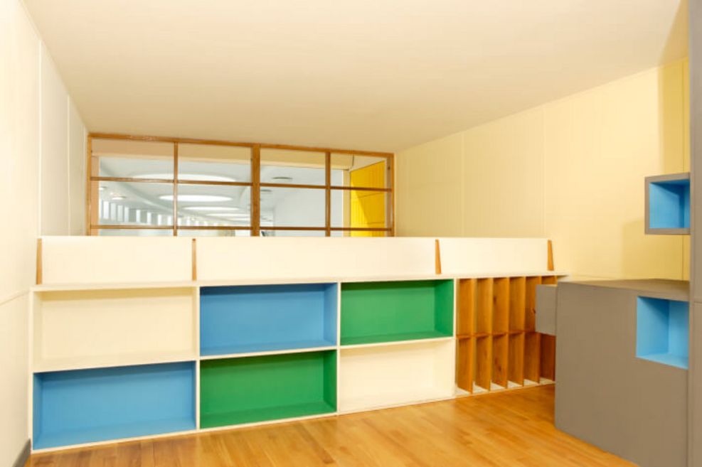
Gallery with coloured built-in cupboards. ©EMOC/CAPA - Pascal Mory 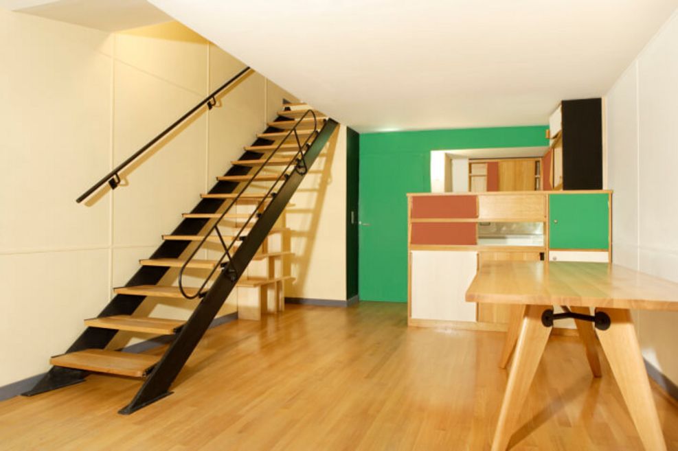
View from living room to built-in kitchen. ©EMOC/CAPA - Pascal Mory 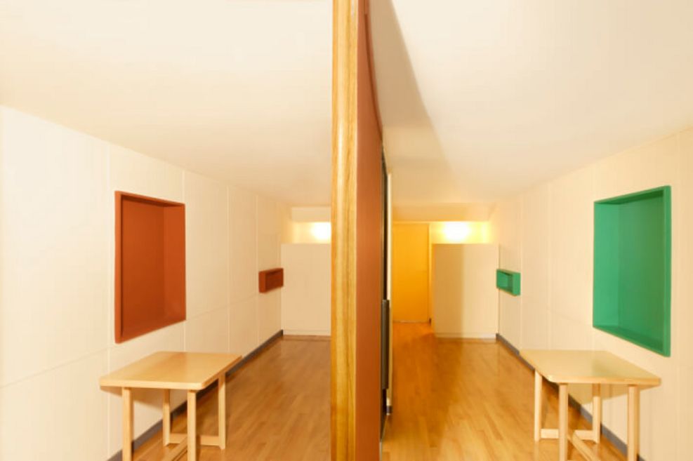
Room divider separate the two bedrooms. ©EMOC/CAPA - Pascal Mory


"Interesting was," he continues, "how Le Corbusier was inspired by his travels, and later transformed the form and function of these objects into his architecture. In a monastery near Milan, he saw the small boxes for the first time, which he later placed next to each entrance door of the Unité."
Le Corbusier used the spatial and human effects of the colours in his buildings of collective housing. He created space in small rooms, fixed and mounted elements, shifted dark corners into the daylight, and aroused the well-being of the individual as well as the collective – he added value to the community.
Relevance of colour in nowadays architecture
"As I already mentioned, many residents changed the colours of the apartments. However, the trend is now back to the original: in order to experience the colouring of the master in its entireness, many residents paint their interior in the original colours. These can be found in the Unité-owned bookstore Imbernon. This is an example that proves that colour in architecture is relevant to residents." Pascal Mory finds that the power and effect of colours is used too little in the current architecture.
"Le Corbusier was not just an architect, he was also an artist and someone who defines colours within a colour system, in a way that they can be harmoniously combined, must definitely be an artist!In the urban context, the colour selection should also consider the colours of each city.“
Architectural Polychromy
"Even architects like Norman Foster (" 30 colours ") designed Polychromies, but these colours look artificial, they lack in something", Mory says. "What makes the Architectural Polychromy by Le Corbusier so unique to me is, among other things, that it was created not only by an architect, but also by an artist. This means that the user has the guarantee to be able to combine all the colours in a consistent manner without creating a misplaced effect. Contrary to the thousands of colours of NCS, I can easily choose from 63 colours and still never miss a colour gradation."
Mory explains that what makes the Architectural Polychromy different of other colour systems is also the quality of the pigments that Le Corbusier used in his special shades, inspired by nature. The colours thus receive an extraordinary brilliance and depth.
"Even architects like Norman Foster designed Polychromies, but these colours look artificial, they lack in something".
– Pascal Mory –
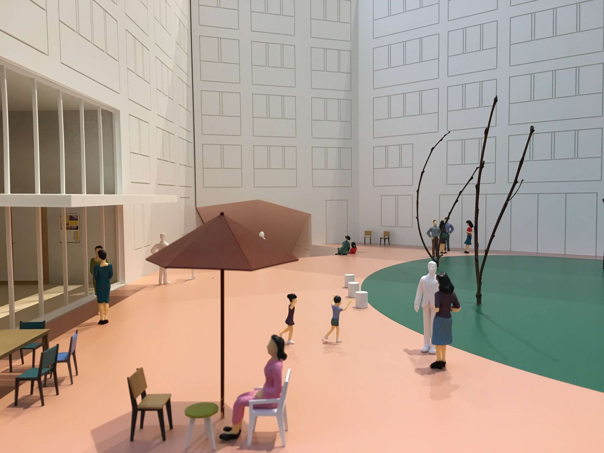
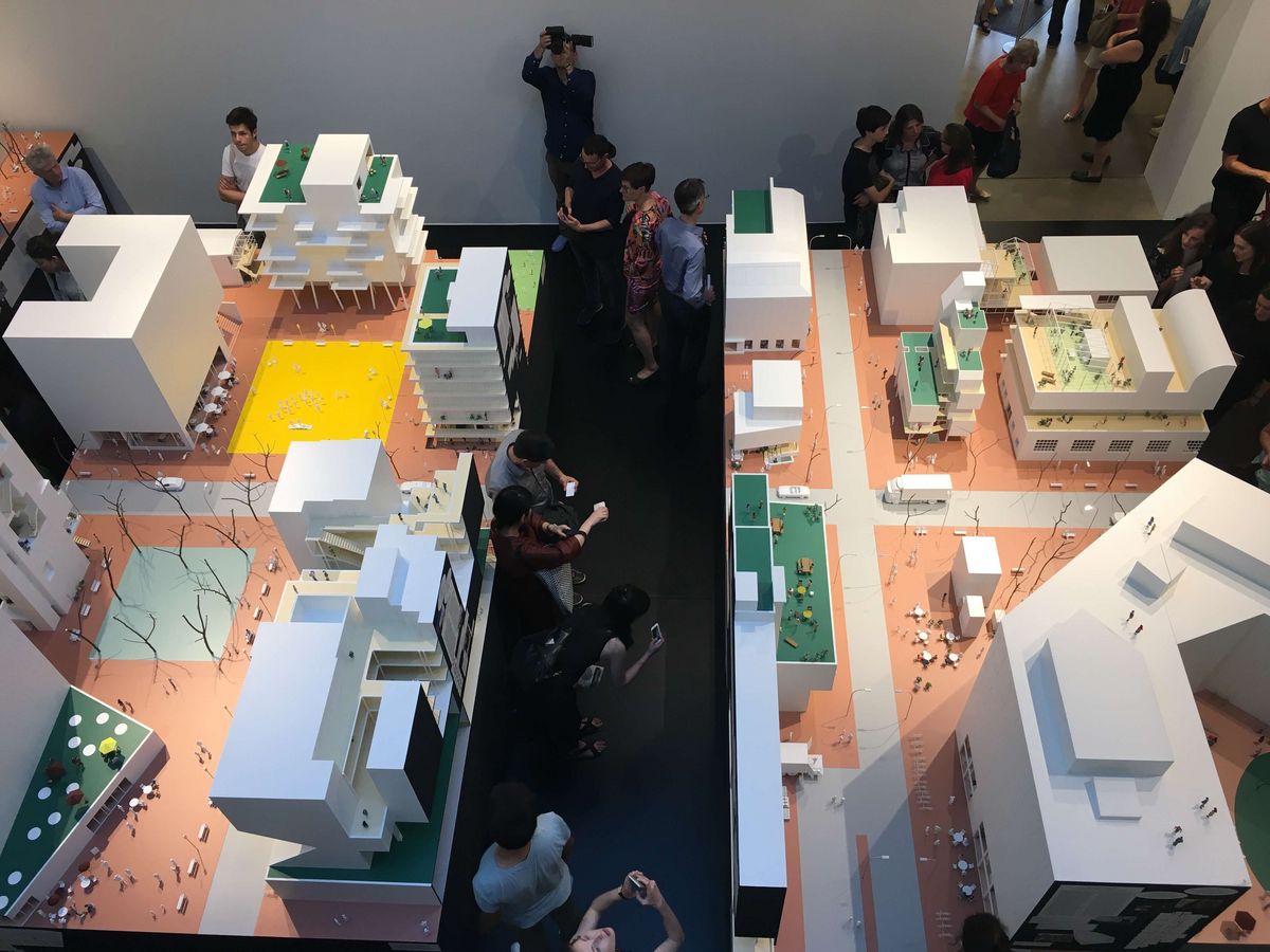
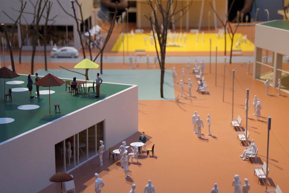
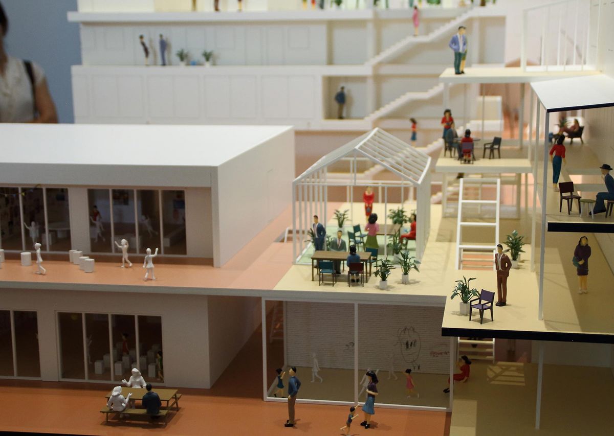
Collective housing
The idea of collective housing is illustrated by the Zurich architectural office EM2N and the Berlin publishers and curators Ilka and Andreas Ruby in the exhibition "Together! The new architecture of the collective". The focus is not only put on social aspect, the implementation of collective project development processes, but also on the new housing typologies in architecture.
While Le Corbusier used the colours on the level of individualization and effect, EM2N used selected colours from Le Corbusier for the coding of the exhibited diagrammatic city model to emphasize the contribution of these new communal housing forms to urban life.
The sectional models show a fictitious city on three sockets with 21 realised projects from all over the world which reflect innovations to collective housing. The responsible EM2N project manager for this project, Fabian Hörmann, explains that the colours can be seen like the coding of a diagram:
"The colour selection took place with large-scale samples in Le Corbusier colours. The colours are all selected according to their natural meaning. We selected Le Corbusier's landscape and English green to design parks, gardens and sports facilities; specific ocher and gray tones for urban places that have a "tougher character". The signal colour yellow was chosen for the assembly place. Furthermore, we have differentiated the degrees of the public and the community with the choice of colour intensity. Le Corbusier was an important mastermind of community housing and used the effect of colours in urban projects. That is why it was obvious to us to work with these architectural colours. It was easy to choose the desired colour effect with the colour fan and the colour samples: contrary to the countless NCS colours, the Architectural Polychromy offers a manageable selection in which one do not miss a nuance and which is always harmoniously."
It is amazing how further dimension of space can be created by colour says Fabian Hörmann. Hörmann sees the relevance of colour in today's architecture from a clear point of view: "White is necessary as a counterweight for a contrasting balance, so that colours can flourish vigorously - in a match of colourful and achromatic."
The exhibition "Together! The new architecture of the collective" can be seen until the 10th of September in the Vitra Design Museum in Weil am Rhein, South Germany.
Read the introductory article of the exhibition: The city as a public living room