The timeless Le Corbusier colours for contemporary architecture
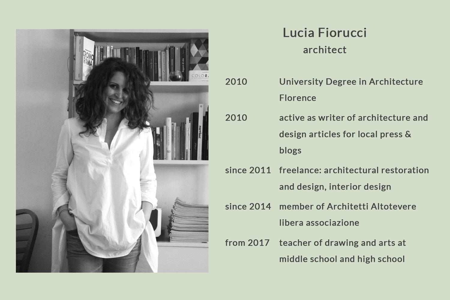
A guest article by Arch. Lucia Fiorucci
"Man needs colour to live; it's just as necessary an element as fire and water."
Fernand Léger
It all started on 19 April 2020 at 16.25 – "fioruluci mentioned you in her story". A live contribution about colour design, the Le Corbusier colours – the Architectural Polychromy – by an Italian architect on Instagram. At 07:45 am on April 20th 2020, we simply had to answer and congratulate on the really good presentation in a livestream (fortunately stories remain available 24h on Instagram). Without the COVID-19 crisis and the conversion of so many architects, artists and lecturers to "online lectures", we would never have met architect Lucia Fiorucci from Città di Castello!
When I studied at University, I examined in deep Le Corbusier and all his work. I studied on a black and white book and I never read about colours in it. I could not imagine that his architecture was full of colours. As we know, if we think about Rationalism, we think about white architecture. If we think about the main Le Corbusier’s villas, we think about white walls. This is because Le Corbusier’s "Polychromie Architecturale" – republished in 2006 – was not as popular as his literary production, which has covered most of the main themes of architecture, from urbanism to design. Thanks to the rediscovery of Architectural Polychromy* and only since very few years, it has been reintroduced the interest about Le Corbusier’s theory of colours in Architecture.
Just a few years ago, I read “Architectural Polychromy” and I literally fell in love with this theme. What I found more interesting about colours and Le Corbusier is his approach.
Le Corbusier was a great painter, and his colours came from nature
Le Corbusier does not recognize himself on the abstraction of colour, but we could define his position as “traditionalist”. During the 1920s, the main concern with colour in modern architecture received its impulses from painting and especially from De Stijl, in which only the primary colours and black were used. In 1921, in his “Esprit Nouveau”, Le Corbusier defines himself “purist” and organizes colours in three different palettes to use in painting. As we know, Le Corbusier was also a great painter and his colours came from nature – he was fascinated by balance of colours in nature – and from history of classical art. In fact, he calls colours “pigments”. In these palettes, there are colours that have specific properties that could be used in architecture. Le Corbusier calls them “architectural colours”, as opposed to “not architectural colours”.
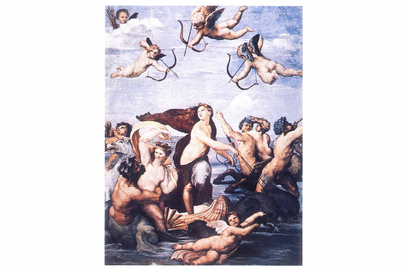
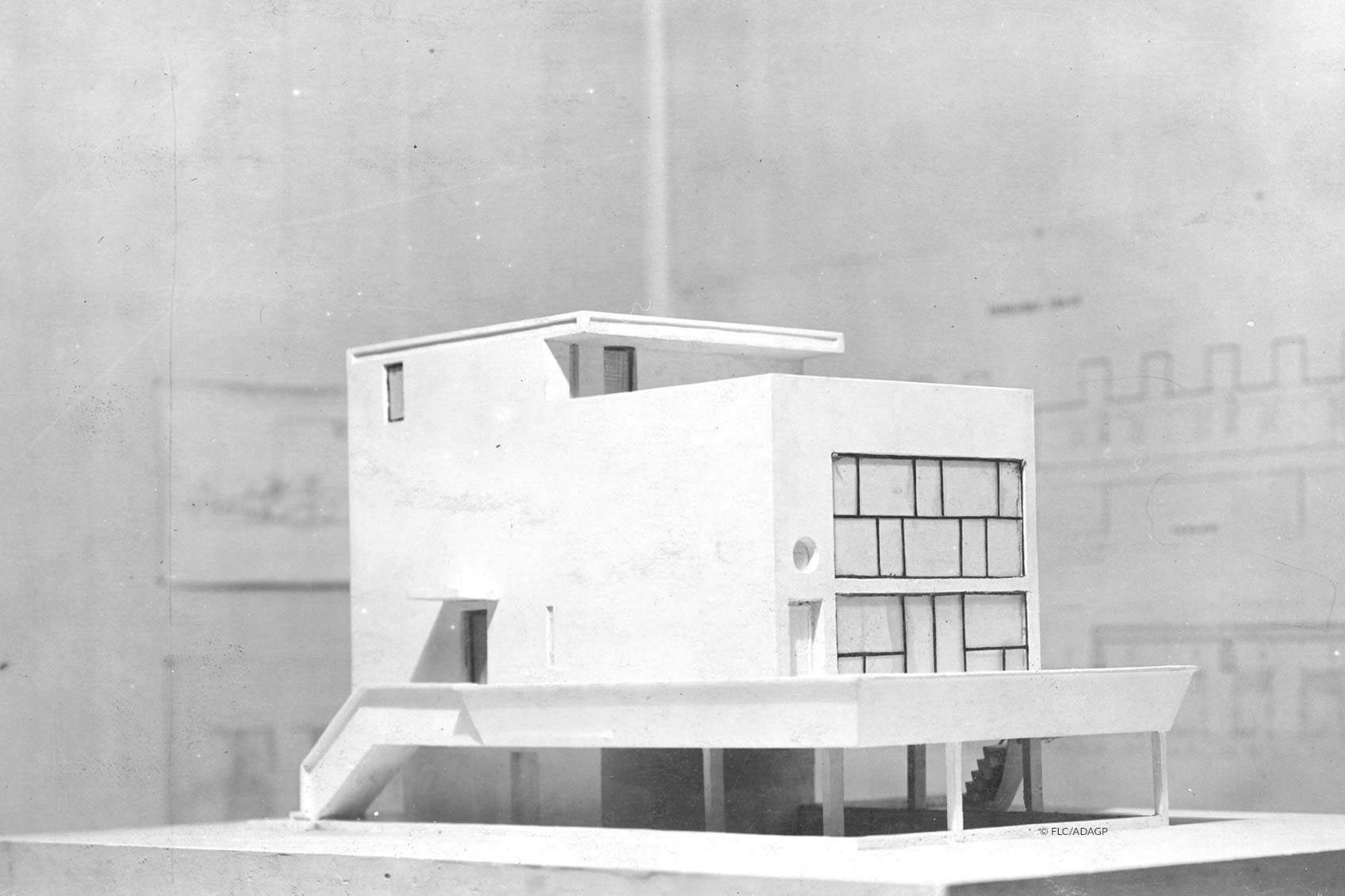
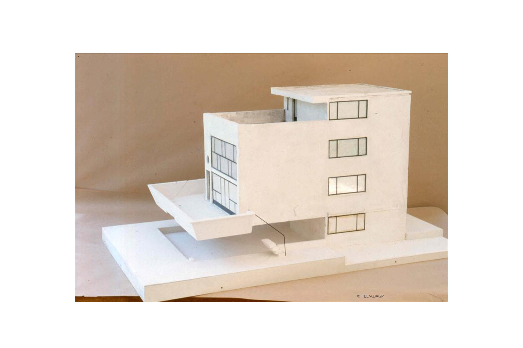
With this approach, the analysis of colours of his Maison Citrohan is in my opinion very interesting. He used the same colours employed in 1512 by Raffaello in “The Galatea triumph”, one of the main important paintings of Renaissance.
The main colours in Maison Citrohan – moods and impressions are conveyed
In fact, the main colours in Maison Citrohan2 are blue, red/pink and grey, which brightness was studied by Le Corbusier. Not only these three colours could define the space and make a classification of the architectonic space and objects, but they could also express emotions. According to Le Corbusier, colours could give moods and different impressions. And that is perfectly true.
Blue – with all of its hues and highlights – creates space, it extends confines. Blue could create distance between walls, up to make it imperceptible. Indeed blue could remove solidity to objects. At the same time, it gives us sensations of calm and peace. On the contrary, Red – as well as all the colours of heart and their hues – represents strength and sensuality and in architectures, it highlights objects and structures. Red could convey to us the exact position of objects in space.
The last of three colours used is Grey, that is the colour of shadows and indifference. So it could be used in architecture to hide objects and everything that is not important. Grey gives us sensations of velvet and calm too.
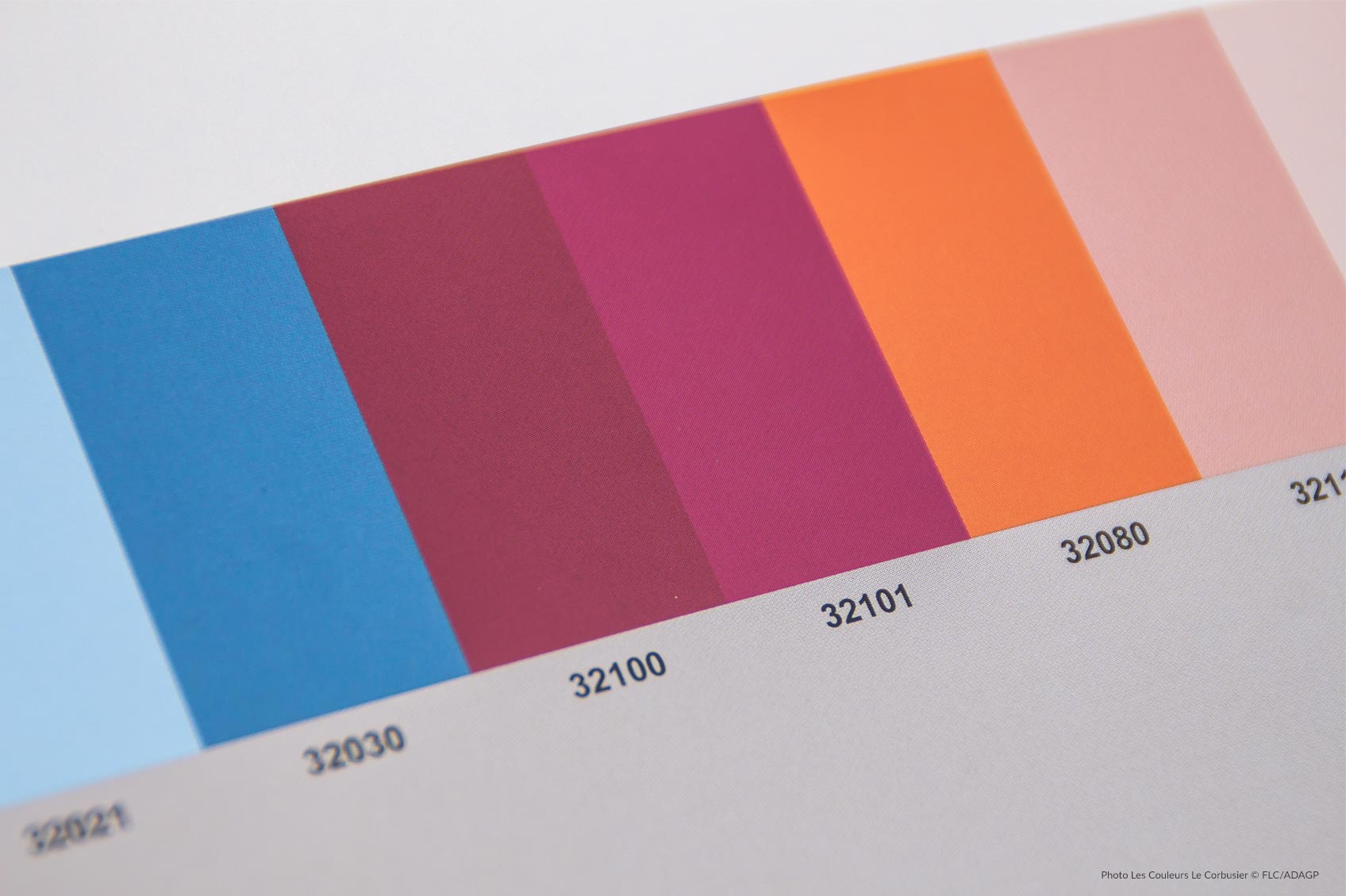
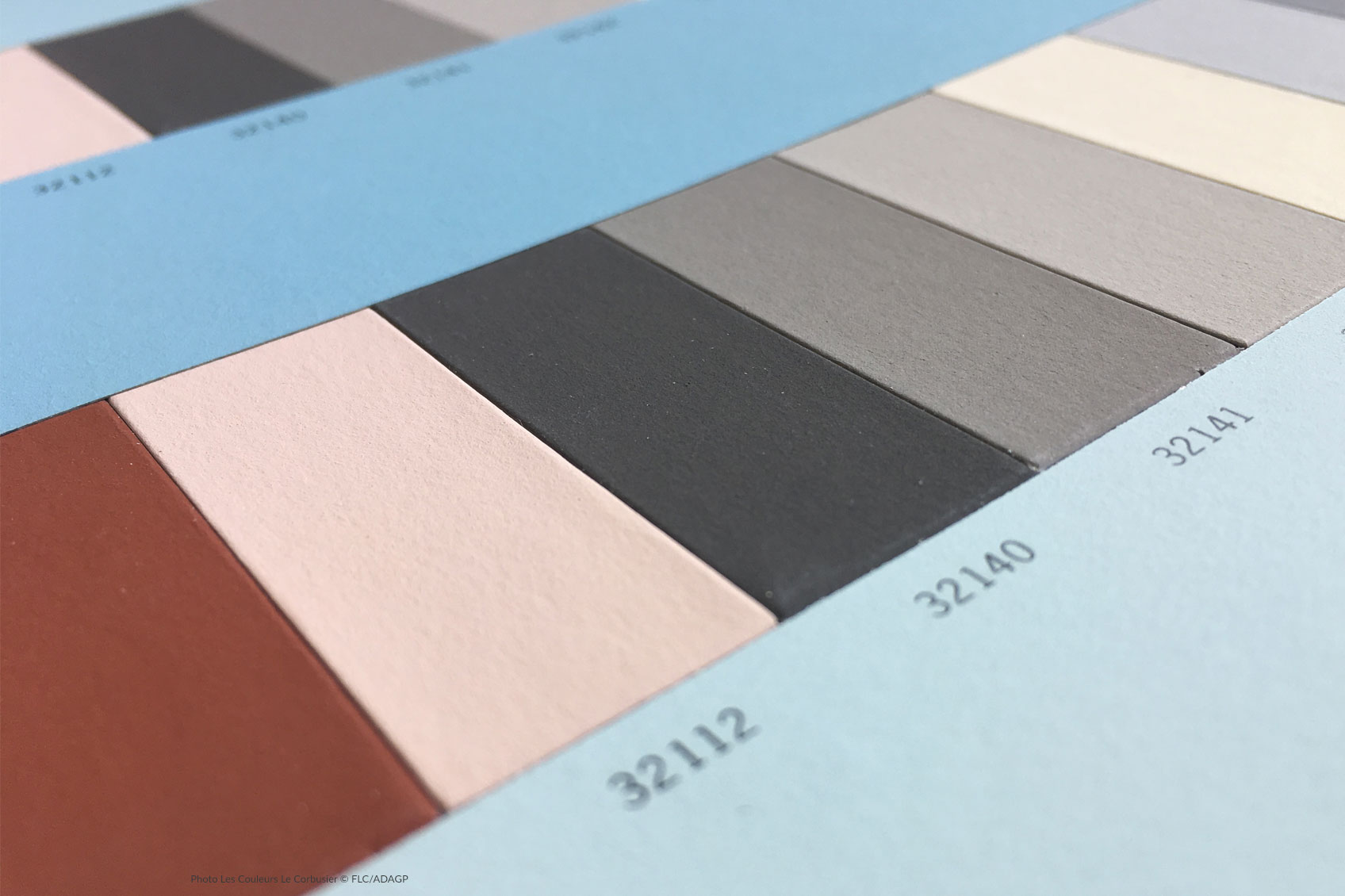
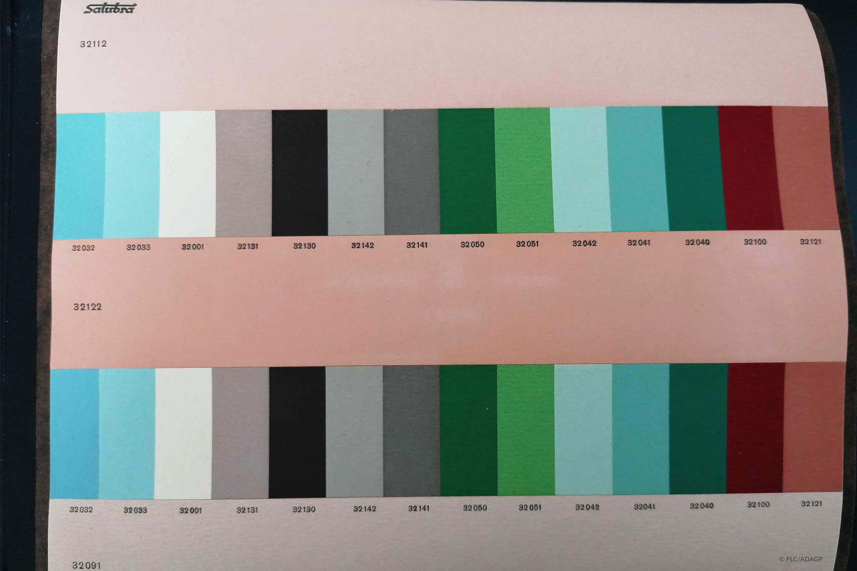
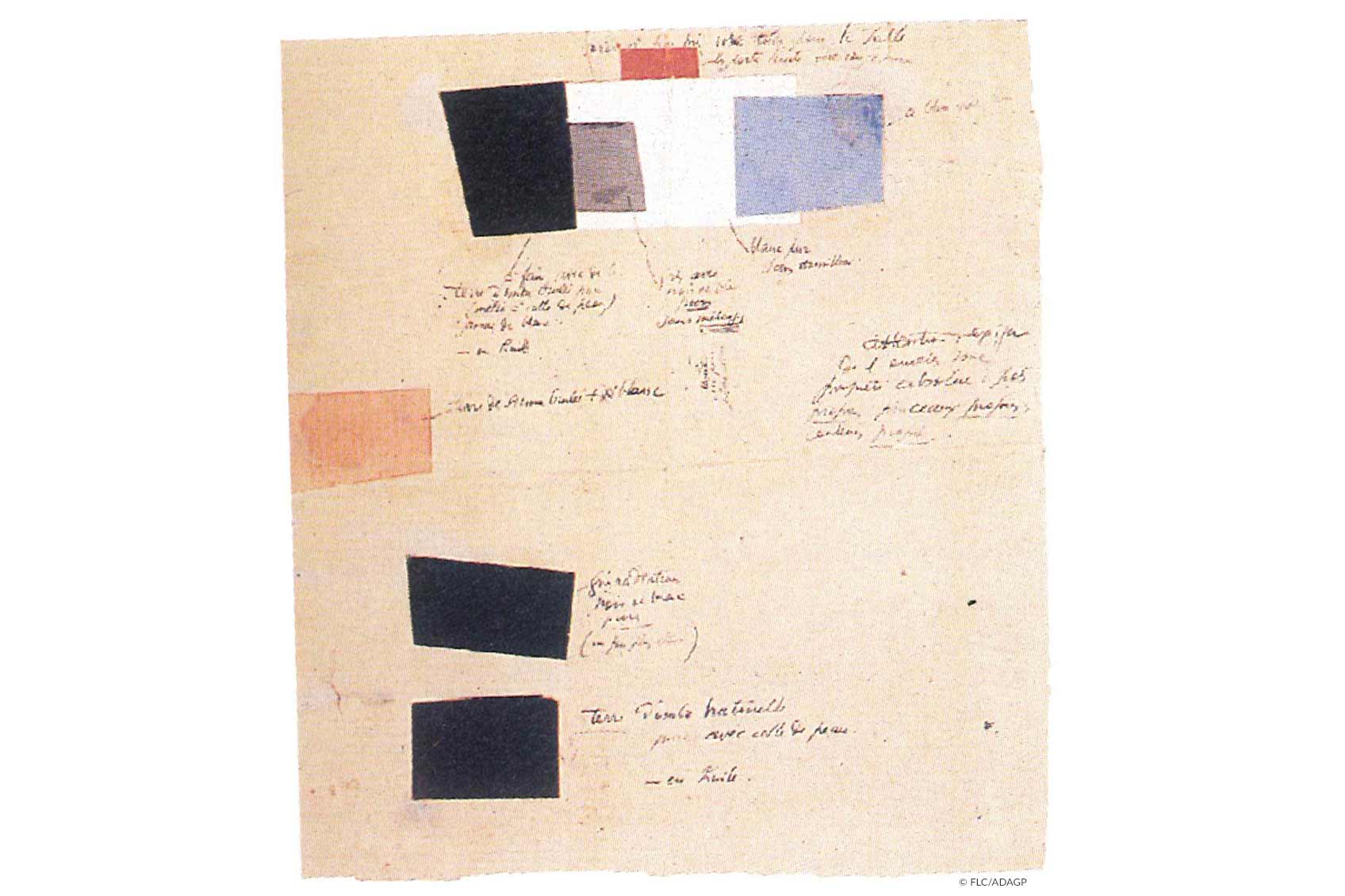
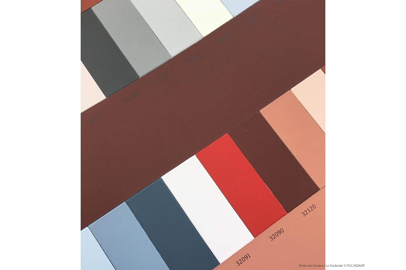
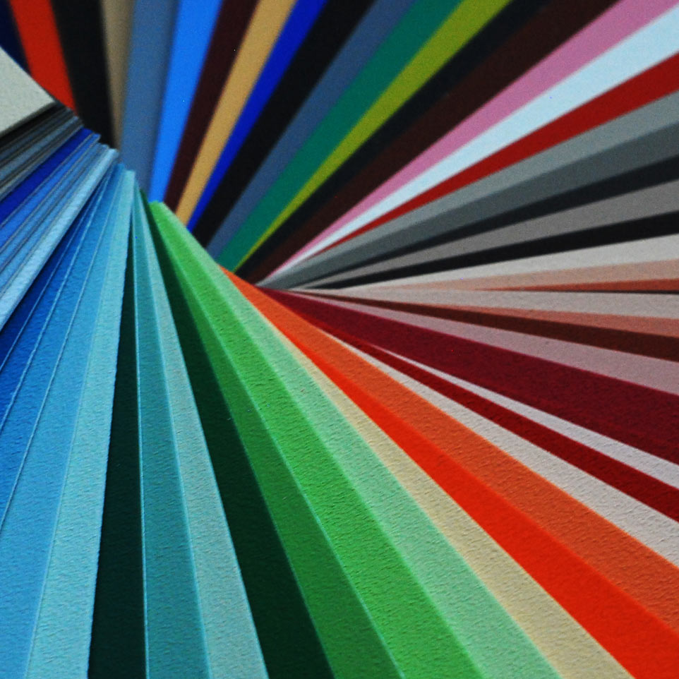
These three colours were the main used by Le Corbusier because they were in perfect harmony with his soul. Blue as opposed to Red, and Grey to match them. We could find them and their related hues on the Keyboard of 1931, in which Le Corbusier organizes his colours with low saturations and great brightness. This Keyboard was used mainly for interior architecture projects. And it is the one I prefer, for the range of hues, especially for his cerulean and ultramarine blue.
“I believe in the power of colours”
In my design, I usually work with colours too, because I really believe in their power and in wellness they could give to people. On my last project, for example, I just had some problems due to existing structures. The space was little bright and so extended. There was also a column in the middle of the room. What I have done, after a little bit of organization of the walls and after designing a bigger window, is to play with colour to organize space in the best way.
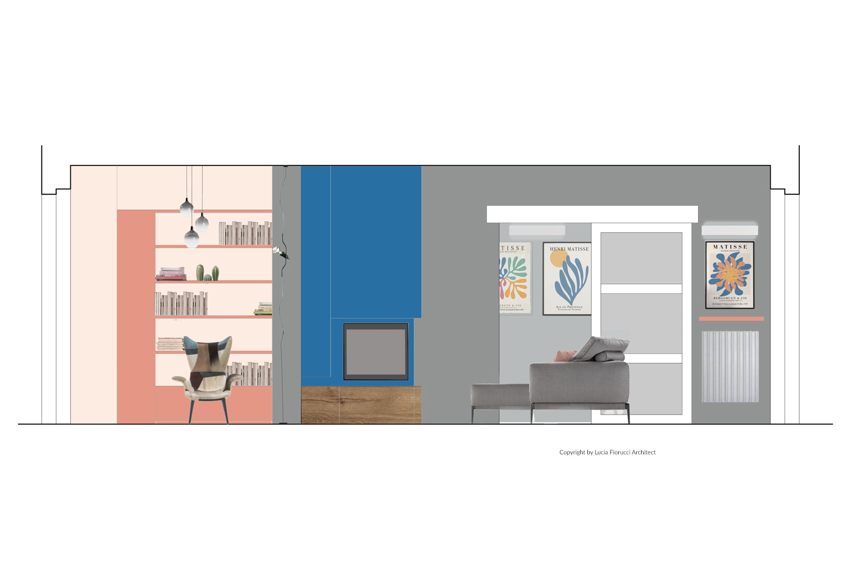
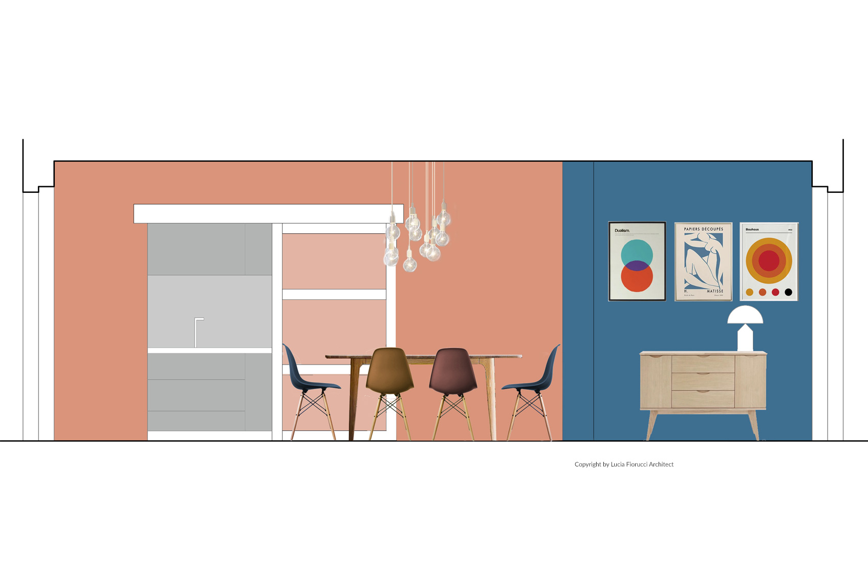
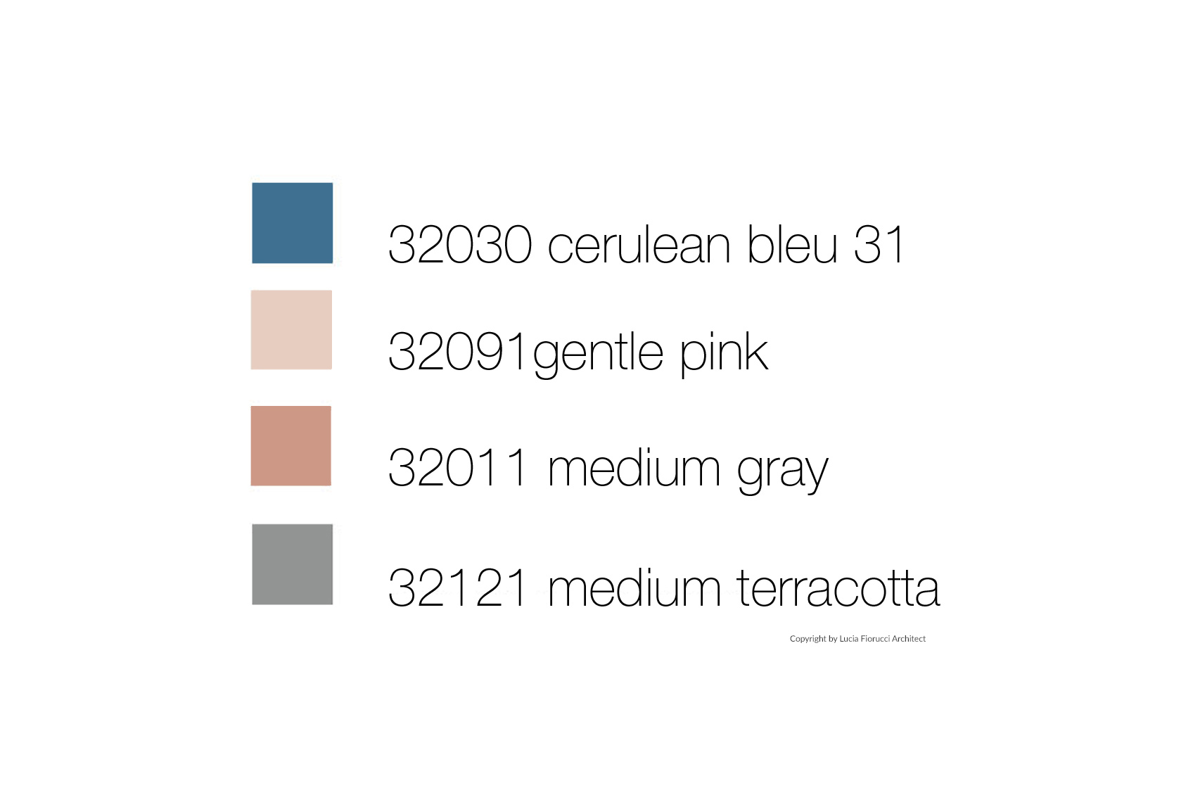
I played the keyboard of 1931 and I chose “Checkered I” in which rather random and garish colour chords were arranged. The first colour I used is 32030 bleu céruléen 31, I literally love it: it appears dynamic and it draws attention. I used it for the main wall and for the suspended bookcase in the middle of the room, just near the column. Then I matched it with two hearty colours: 32111 l'ocre rouge moyen (the medium Terracotta) and 32091 rose pale (the Gentle Pink), which is the first shade with “Masonry” significance. They were used for the dining room wall and for the corner just behind the blue bookcase.
The timeless Le Corbusier colours for contemporary architecture
In order to combine them, I used 32011 gris 31 (the Medium Grey), which is elegant and restrained, suitable for walls, furniture and for everything that could seem not so interesting – as well as for the column in the middle – and which gives breath to the whole space.
Therefore, in this project, everything has a special bright. Objects, furnitures and walls could communicate with each other with elegance and functionality. The result, by using Le Corbusier colours, is a dynamic, comfortable and timeless space. In my opinion, in fact, Le Corbusier colours are timeless, and this is the reason why they can still make contemporary a space in today’s architecture.
**********
We thank Lucia Fiorucci for her great contribution to our Les Couleurs® Le Corbusier Blog and Article collection. It was a great pleasure to exchange with you!
issuu.com/luciafiorucci
https://www.instagram.com/fioruluci/
https://www.the-mag.org/author/fiorucci-lucia/
https://www.facebook.com/luciafiorucciarchitetto
* The first attempts in polychromy mentioned by Le Corbusier in the Oeuvre complète concern the interiors of the La Roche und Jeanneret Houses in 1923. Le Corbusier created two color "keyboards" for the Basel wall-paper company Salubra, the first one in 1931 and the second in 1959. The pattern cards consists in isolating three to five colors at a time and each card points to the spatial effect that is to be achieved: "Space", "Sky", "Velvet",... These color keyboards are formalizations of Le Corbusier's way of working and thinking and with which he succeeded in making a theory directly available in practice. The dissemination of the Polychromie architecturale has been entrusted to the Swiss firm, Les Couleurs Suisse. This Architectural Polychromy has been a constant source of inspiration for the world of architecture and design. (Source: http://www.fondationlecorbusier.fr, Missions)
2 Serial house "Citrohan" (not to say Citroën). In other words, a house like a car, designed and arranged like an omnibus or a ship's cabin. The current needs of housing can be specified and require a solution. (Source: http://www.fondationlecorbusier.fr/ Buildings, Projects)
Pictures:
- Extract from Le Corbusier's book of architectural colours, ISBN: 978-3-033-05574-2 ©FLC/ADAGP – Les Couleurs Suisse
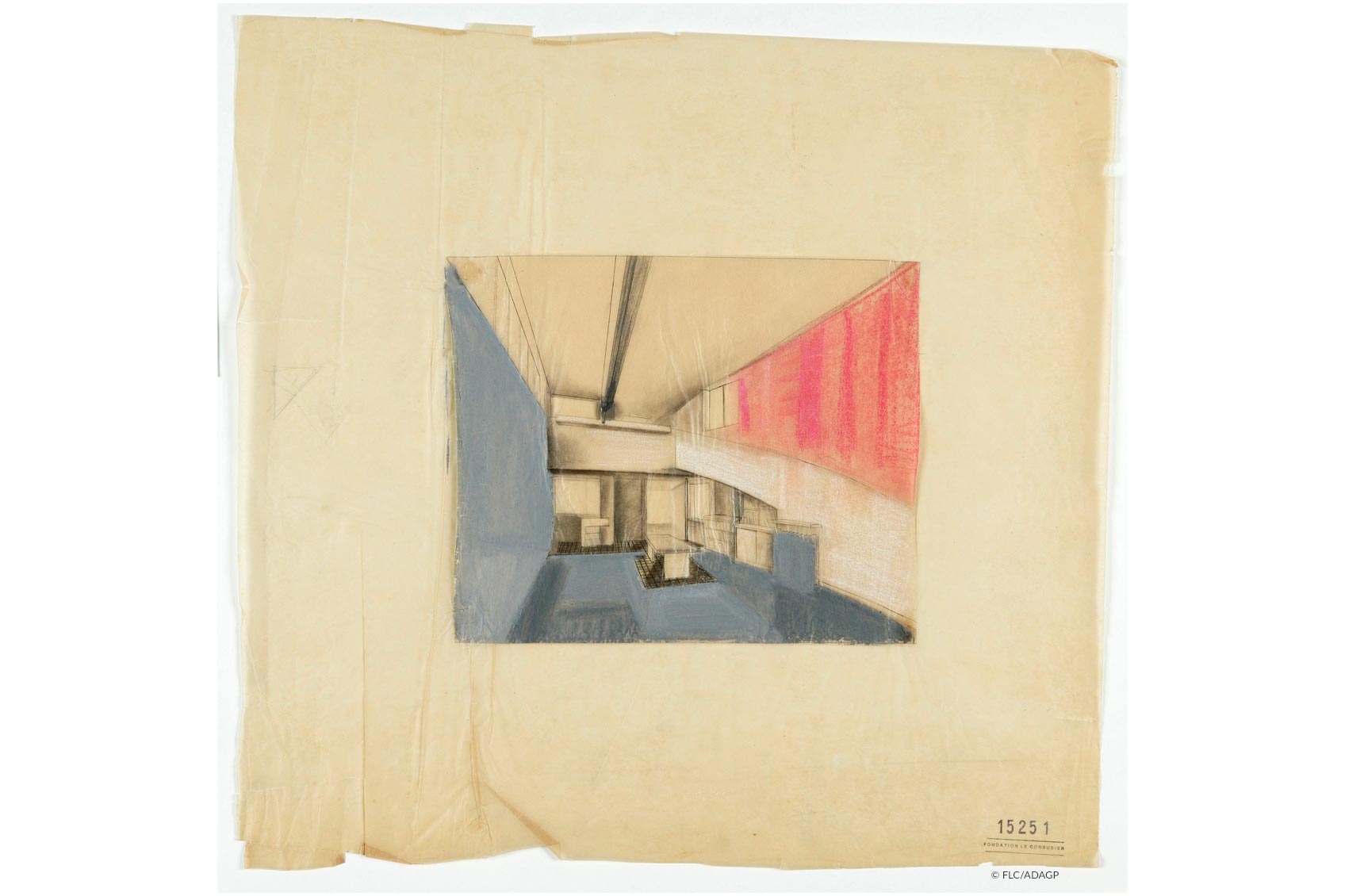
- first attempts in polychromy by Le Corbusier concern interiors of Maisons La Roche-Jeanneret ©FLC/ADAGP
- Extract from the Original Salubra Book of Colour Keyboards ©FLC/ADAGP
- The Galatea triumph, Raffaello Fresco Villa Farnesina, Roma, 1512
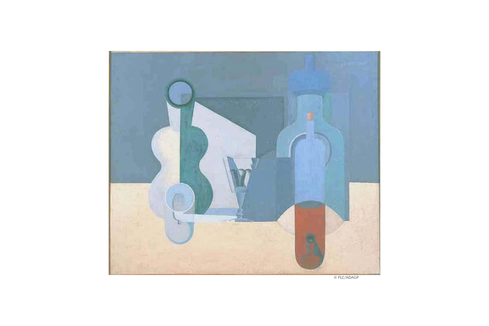
- La bouteille de vin orange, 1922 © FLC/ADAGP
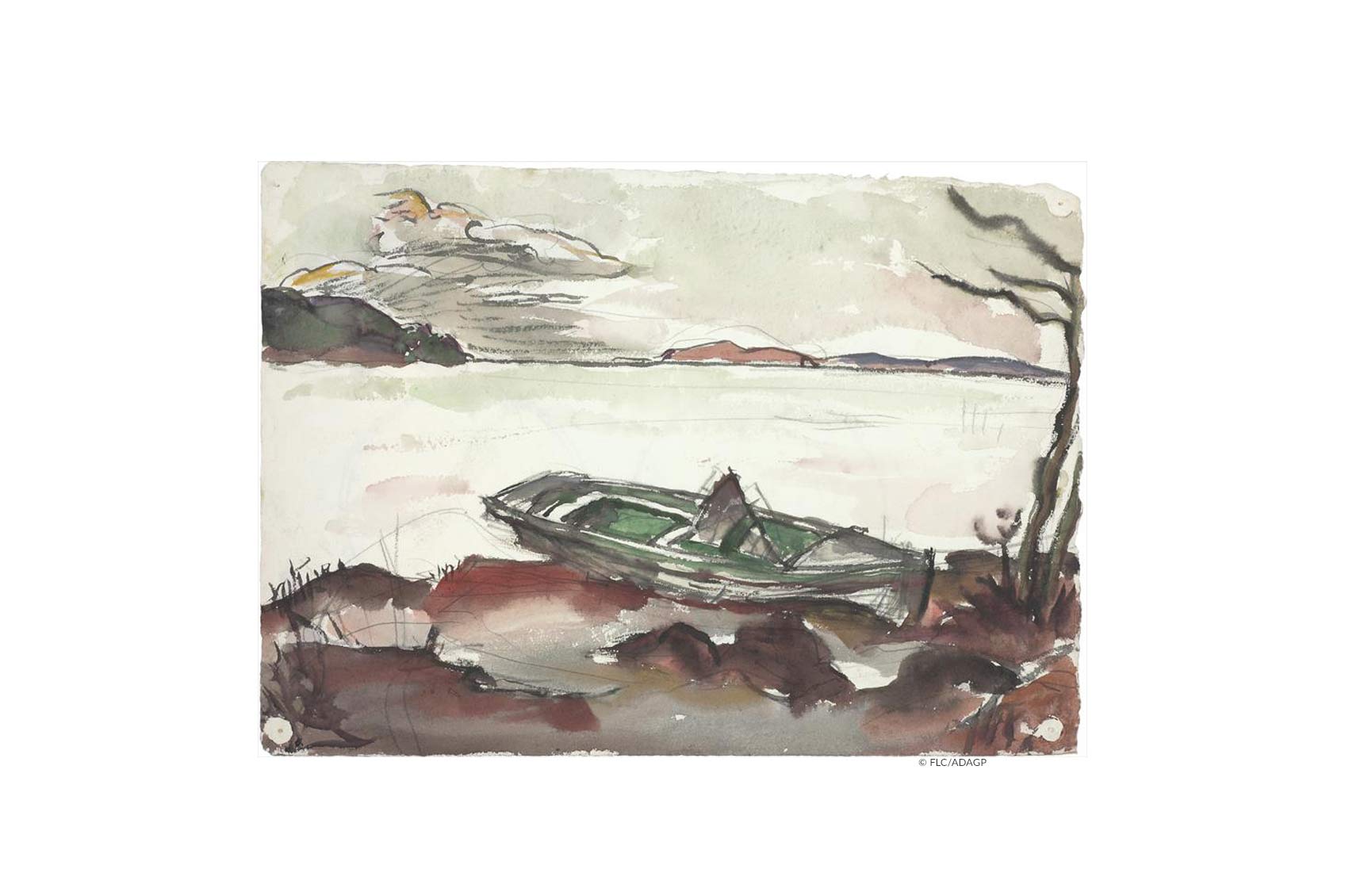
- Paysage du lac de Bienne, 1915 © FLC/ADAGP
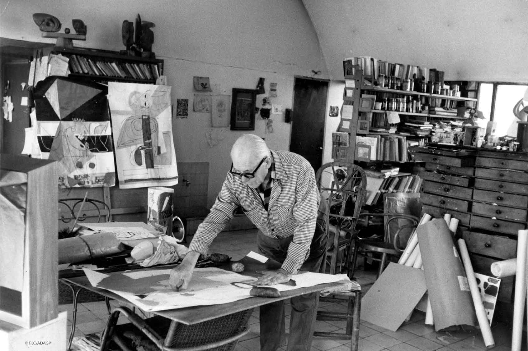
- Le Corbusier painting © FLC-PROLITTERIS
- Maison Citrohan Sketches, models © FLC/ADAGP
- Section schemas of work ©Lucia Fiorucci Architect


![[Translate to EN:] Le Corbusier's Farbenklaviaturen Standardwerkzeug für architektonische Farbgestaltung ISBN: 978-3-033-06113-2 Photo Les Couleurs Suisse ©FLC/ADAGP [Translate to EN:] Le Corbusier Farben Klaviatur ©Les Couleurs Suisse - FLC/ADAGP](/fileadmin/media/produkte/les-couleurs-le-corbusier-produkt-buch-farbenklaviaturen-1110x1110px-12.jpg)
![[Translate to EN:] Zum Artikel Architektur Prommenade Le Corbusier in Frankreich [Translate to EN:] Zum Artikel Architektur Prommenade](/fileadmin/media/journal/Le_Corbusier/Architekturpromenade_FR/Cube-Les-Couleurs-Le-Corbusier-Article-Architectural-Culture-Promenades-France.jpg)


Comments
No Comments