Rado True Round x Les Couleurs® Le Corbusier® Special Edition: when modernism becomes wearable design
- info423884
- Mar 12
- 3 min read

There are collaborations that borrow from design history and then there are collaborations that build with it. With the Rado True Round x Les Couleurs® Le Corbusier® Special Edition, colour is treated as Le Corbusier intended: not decoration, but a precise architectural tool, grounded in structure, harmony, and proportion.


The collection has been unveiled during India Art Fair 2026, at the NSIC Exhibition Grounds, Okhla, New Delhi, a setting that naturally mirrors the collaboration’s intent: a meeting point of culture, design, and contemporary creation. The official launch on 6 February brought Rado CEO Adrian Bosshard together with Brigitte Bouvier, Director of the Fondation Le Corbusier, underscoring the project’s dual foundation: material innovation and fidelity to cultural heritage.

Concrete, translated: the dial as an architectural surface
What makes this trio particularly refined is its tactile concept. Each dial features a laser-engraved abstraction of a concrete surface drawn from one of Le Corbusier’s landmark works, a subtle relief that catches light the same way as architecture does: slowly, honestly, and with depth.
1) La Cité Radieuse, Marseille (1952): restraint, precision, light
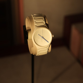
The first edition pays tribute to La Cité Radieuse in Marseille, completed in 1952, an icon of modern urban thinking, and a masterclass in how raw material and disciplined proportion can create a new idea of living.

Its dial carries an engraved reference to the building’s béton-brut texture, while the monobloc ceramic silhouette is rendered in blanc ivoire 4320B across the case and crown, with a matching blanc ivoire 4320B bracelet. This edition is complemented by hands in outremer moyen 32021 (hour hand), bleu outremer 31 32020 (minute hand) and outremer pâle 32023 (second hand).
2) Carpenter Center for the Visual Arts, Cambridge, Massachusetts (1963): pure volume, controlled contrast
The second watch honours the Carpenter Center for the Visual Arts in Cambridge, Massachusetts, Le Corbusier’s only building in North America, completed in 1963. It stands as a late-career statement: sculptural, unapologetic, and radically modern in its presence.

Here, the collection leans into architectural monotone. Case and crown appear in gris foncé 31 32010, with a dial in gris foncé 31 32010 and a matching bracelet, a composition that reads like a concrete façade reduced to its essence. The hands introduce sharp, deliberate punctuation: Cream blanc 32001 lacquered hour hand, orange vif 4320S lacquered minute hand, and vert anglais clair 32041 lacquered second hand.
3) Palace of Assembly, Chandigarh (Capitol Complex, 1962): civic scale, saturated accents
The third edition looks to Le Corbusier’s visionary plan for Chandigarh, and specifically the Palace of Assembly at the Capitol Complex, completed in 1962.

Its dial engraving references details from the building’s façade, while the ceramic architecture deepens into a darker palette: noire d’ivoire 4320E case and crown, a dial in noire d’ivoire 4320E, and an noire d’ivoire 4320E bracelet. The hands are lacquered and unmistakably graphic: orange vif 4320S (hour), vert 59 4320G (minute), vert olive vif 4320F (second).
The enduring relevance of Le Corbusier’s palette lies in its purpose. Conceived as a universal language for architecture, the colours were chosen for natural harmony and infinite combinability, a system designed to support space, proportion, and atmosphere rather than overpower them.


By bringing this system to life in high-tech ceramic, Rado and Les Couleurs Suisse® reaffirm a shared belief: materials carry meaning, and colour, when treated as architecture, becomes timeless. The True Round x Les Couleurs® Le Corbusier® Special Edition is, in this sense, not only a watch collection, but a precise, wearable expression of modern design culture.


Comments