

Colour Philosophy in Architecture and Design – Grey (All about the Grey Scale) - Part III
In the concluding part of our grey trilogy, we discuss Greyscale. Greyscale is the collection or range of monochromic (i.e. grey) shades (recalling that a tint is colour plus white; a tone is colour plus grey and a shade is colour plus black).
Greyscale values range from pure white on the lightest end of the colour spectrum which equates to a Value of 10, to pure black on the opposite end of the spectrum with a Value of 1. All of the values ranging from 2 to 9 are different singular shades of grey. Greyscale contains only brightness information as there is no colour present.

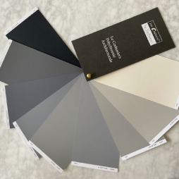
Considering Le Corbusier’s Architectural Polychromy vis-à-vis the standard greyscale values’ formula, Le Corbusier’s greys would most likely be arranged as follows:
Value 1: 4320E Noir d’ivoire
Value 2: 32010 Gris Foncé 31
Value 3: 4320U Gris Foncé 59
Value 4: 4320H Gris 59
Value 5: 32011 Gris 31
Value 6: 43200 Gris Clair 59
Value 7: 32012 Gris Moyen
Value 8: 32013 Gris Clair 31
Value 9: 4320B Blanc Ivoire

In digital photography, a grayscale image is one in which the value of each pixel is a single sample representing only an amount of light; that is, it carries only intensity information, composed exclusively of shades of grey. The contrast ranges from black at the weakest intensity to white at the strongest. – Wikipedia
Who remembers the dreaded identically-named greyscale à la Game of Thrones? - the leprosy-like fatal disease which left the condemned one’s flesh stiff and dead, and was stone-like to the touch. Again, grey was used there in a guise with such negative connotations, a deadly irreversible unsightly disfigurement.
There was also stigma associated with this disease (which is similar to leprosy), and grey does seem to have many more negative connotations than positive ones. People often tend to conceal their true identity behind grey – believing that grey is a safe cocooning colour, but by allowing brighter colours into the foreground, greys become so effective and this is clearly demonstrated in the Velvet atmosphere.

Grey can sometimes be used to refer to something that’s neither one thing nor another i.e. a grey area, perhaps indicating indecision. It’s also curious that grey hair normally comes with age, as does wisdom, yet millions of people worldwide pay huge amounts of money to conceal their grey hairs, compared to some generation Z-ers who choose to dye their hair grey… perhaps feigning inner wisdom or is it just a temporary trend?
Grey, just like Le Corbusier’s Architectural Polychromy is forever en vogue, irrespective of what is on trend at a given time.
Using a selection of complementary tonal greys in a space adds intrigue and depth, but it’s essential to incorporate different textures in order for the scheme not to appear too flat. As mentioned in a previous article, many people initially find grey used in an interior to have a tranquil and hibernating effect, yet over time, is often associated the heaviness which can affect their psyche and one can begin to feel exhausted and depressed.
In part I, we talked about colours which complement grey, how these harmonious pairings create a joyful and productive environment.

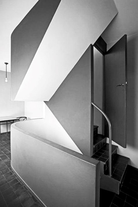
Comparing two identical images, where one is in colour and the other in greyscale, is interesting. Studying the greyscale image, note how the 32010 gris foncé 31 is vividly emphasized, equally how the 32060 ocre appears as such a prominent white, and interestingly see how the door painted in 32110 l/ocre l rouge is indiscernible from the gris foncé.
Both images are equally impactful, and intriguingly the linear incline of the flush plaster bulkhead is so much more accentuated. The power of greyscale images should never be underestimated: they are timeless and can be quite commanding.
In conclusion, the incredibly architectural shade of grey is very much an enigma. Grey is a sophisticated neutral, bringing calm and tranquillity to many. We highlighted the fact that one of its key benefits is its ability to form an ideal background shade, complementing brighter colours within an arrangement.
The spectrum of greys runs from cool to warm, and it is incredibly versatile in many schemes. Grey comes in a myriad of shades which works well in a plethora of settings, creating a multiple of different moods. So, whether it’s creating drama using the darker end of the spectrum, or by utilizing cooler greys to create a soft cocooning feel, or even by staying tonal to create a timeless classic, enjoy exploring the versatility of grey, the neutral – or maybe by simply incorporating a gallery wall of greyscale photographs into your scheme.
Lesen Sie weitere spannende Artikel :
Colour Philosophy in Architecture and Design – Grey (All about the Grey Scale) - Part III. »

Colour Philosophy in Architecture and Design – Grey (A Dorian story) - Part I»


Comments
No Comments