"To choose, one must not feel one after the other, but simultaneously. To choose, one must see what is at stake, and the eye must be like an existing tool in the service of a deep instinct. One must facilitate its task, eliminating the unfruitful fatigues (efforts of memory). One must classify, display a selection. The eye must be able to see! Objectively, really".
- Le Corbusier –
With the Architectural Polychromy by Le Corbusier, design and architecture have a tool for colour design that helps change or support spatial effects through colours. Le Corbusier focused on natural colour pigments of the time when he chose his colours. He was fascinated by the balance of colours in nature and created an arc to connect with nature as well as with the intimacy and tradition of painters and architects. For Le Corbusier, it was precisely the dynamics of colours that played an important role.
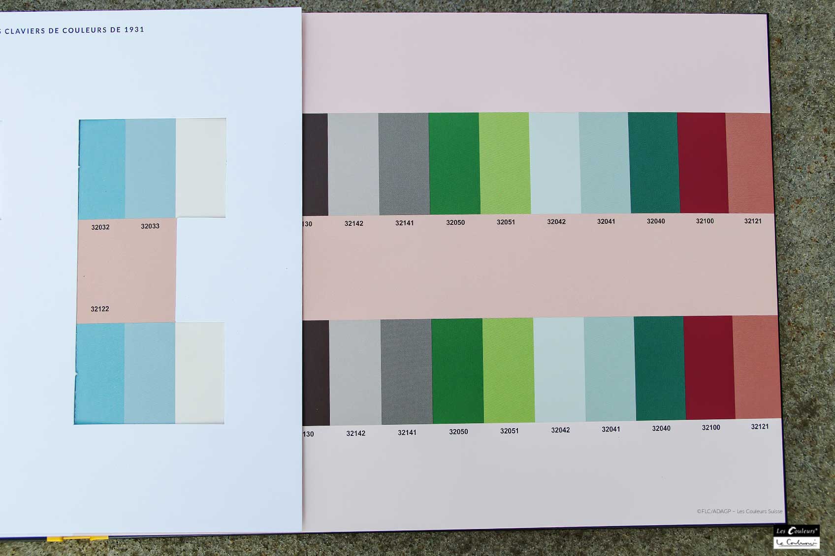
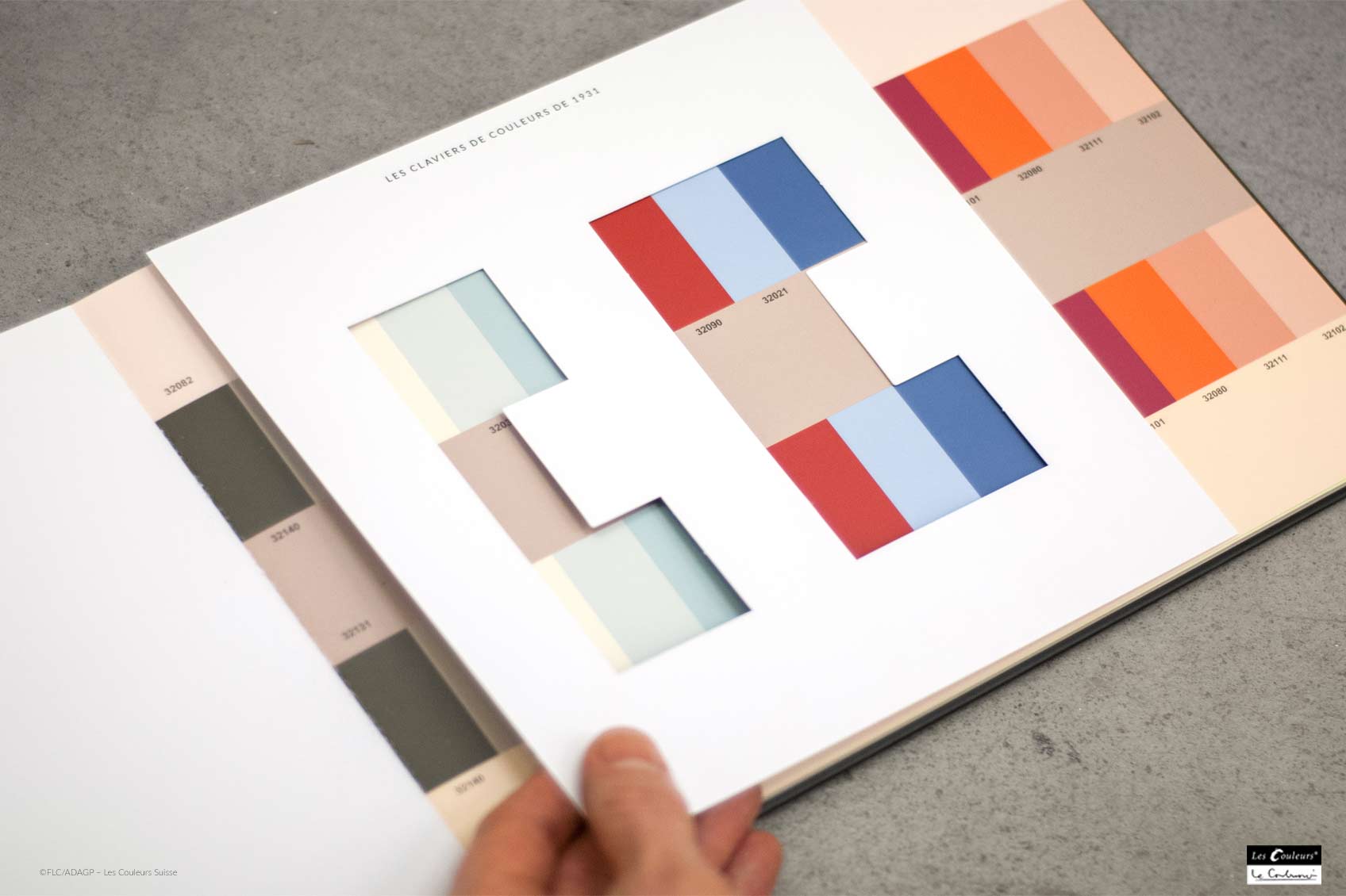
The distinction between static and dynamic colour tones shaped the composition of the first keyboard in 1931. The practice at that time was to create bound sample books – but Le Corbusier meant to do things differently. He created different colour moods corresponding to the specific characteristics of the colours.
Colour moods according to Le Corbusier
Colours influence our lives, convey energy and have character. The natural and harmonious colours of the Architectural Polychromy create moods. With his 1st colour keyboard, Le Corbusier develops nine spatial colour moods, each with three murals, and designates each mood with a name that indicates the intention and expresses the polychromatic action.
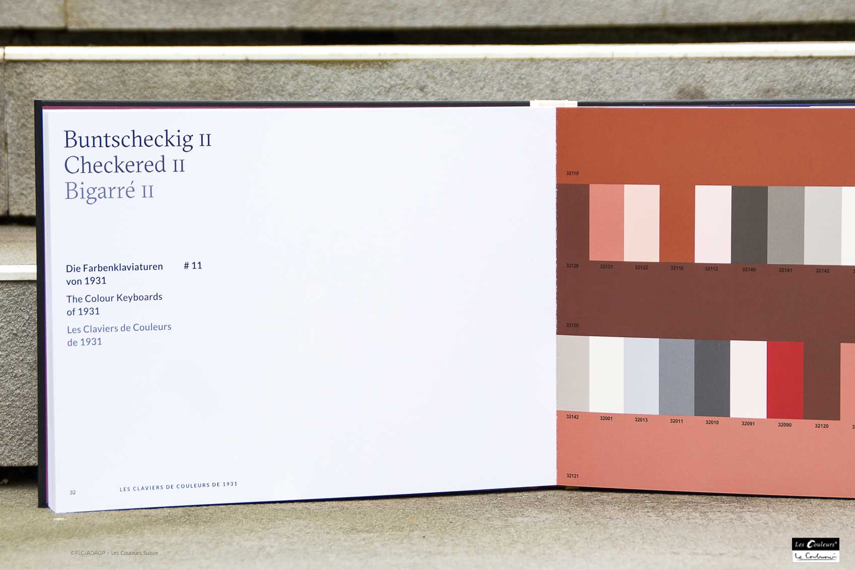
Le Corbusier described rather random triads as ‘Checkered’. The colour moods offer many suggestions and, with colour harmonies, they evoke sensations in the viewers and users of the colour keyboards. The moods show the colour tones with a certain mural value as background – based on the first collection of 1931.
The "glasses" make it possible to isolate two to four tones on the background shades as well as a single tone on two background shades. This allows undreamt-of colour combinations for excellent design to be created and matched. The colour keyboards from 1931
Espace / Raum / Space
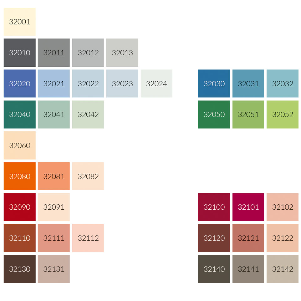
32022 outremer clair, 32023 outremer pâle and 32024 outremer gris form the basic colours of the mood space. To combine colours in this mood, Le Corbusier proposes colours, especially in shades taken from the groups red ochre and brown, umber and grey.
Ciel / Himmel / Sky
The three light shades of cerulean blue including 32033 céruléen clair and 32034 céruléen pâle are the basic colours here. 32090 rouge vermillon 31 is the shade that Le Corbusier uses most often as a combination colour.
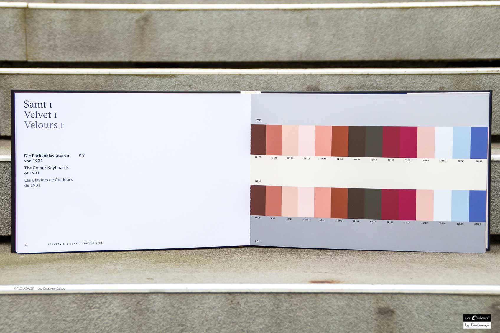
Velours / Samt / Velvet (I und II)
The particularly recommended colour combinations in the velvet mood come from the colour groups red ochre and brown, red, ultramarine blue and umber. The three shades 32001 blanc, 32012 gris moyen and 32013 gris clair 31 create the velvet mood.
Mur / Mauer / Masonry (I und II)
The colour mood wall after Le Corbusier shows very attractive combinations with umbras and with green tones as well as with cerulean blue nuances. One of the three basic colours is 32091 rose pâle.
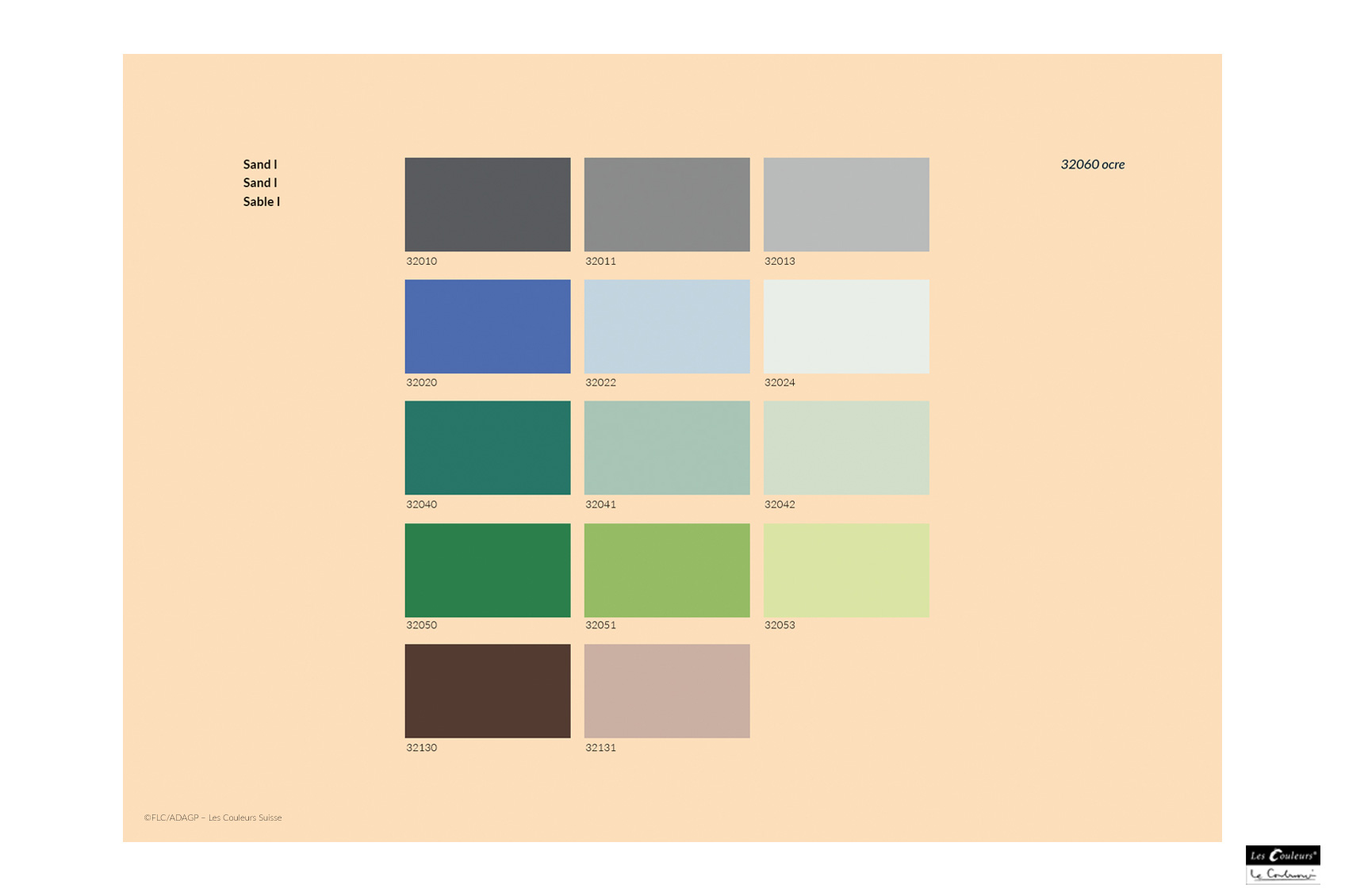
Sable / Sand (I und II)
The second sand atmosphere impresses with combinations of the three murals with shades of blue, red and umber. 32082 orange pâle and 32131 ombre brûlée claire are, along with 32060 ocre, the basic tones of this colour mood of the Architectural Polychromy by Le Corbusier.
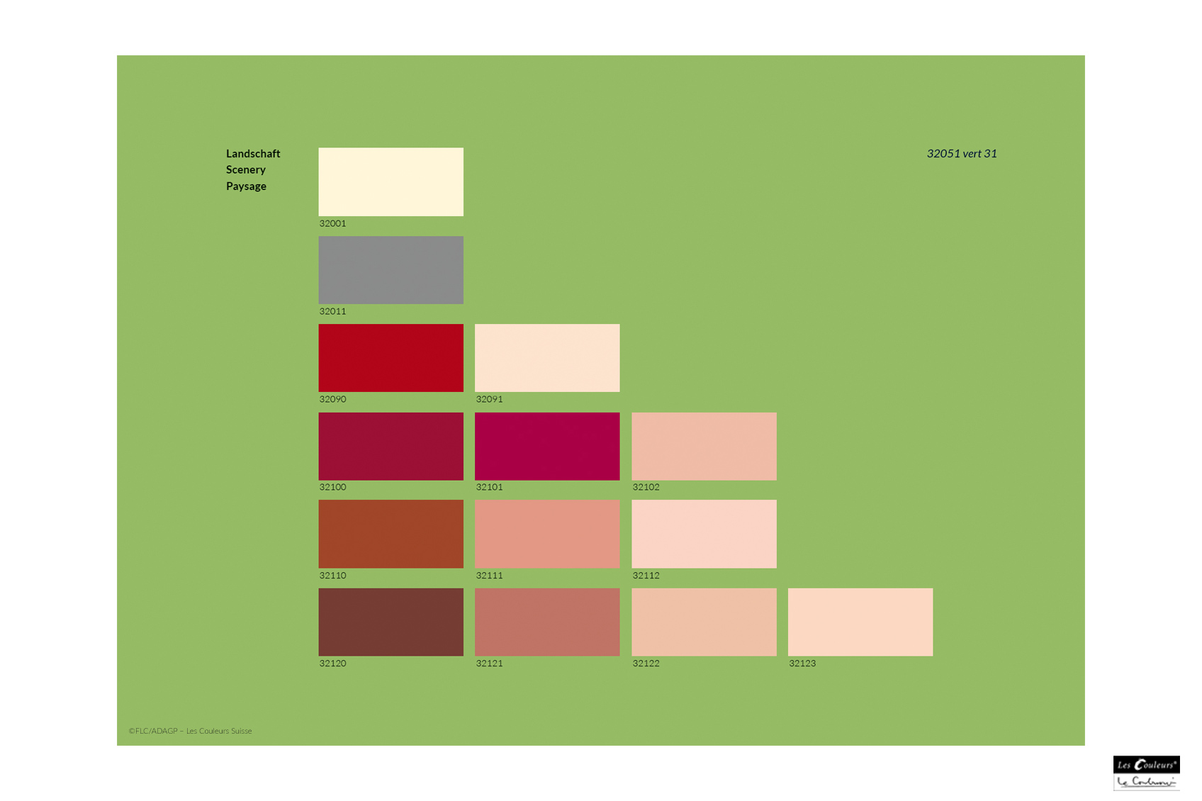
Paysage / Landschaft / Scenery
Three shades of green from the 50 series (not the brilliant green 32050 vert foncé) are the basic shades here and reflect the green of the landscape. Le Corbusier used nuances of green selected from this colour group.
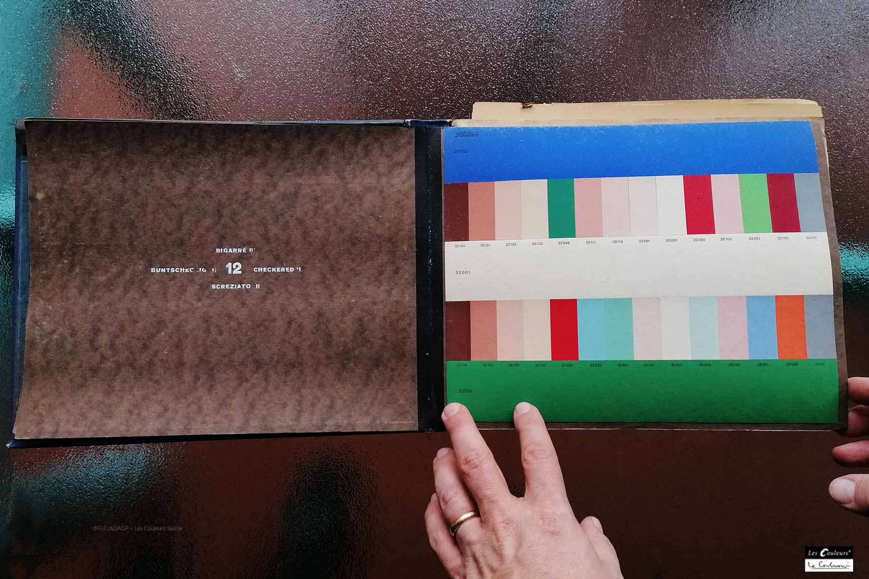
Bigarré /Buntscheckig / Checkered (I, II und III)
Here, rather random and garish color chords are arranged. In Checkered III, for example, the basic colours 32020 bleu outremer 31, 32001 blanc and 32050 vert foncé are combined with 32040 vert anglais or 32090 rouge vermillon 31. Le Corbusier said about this that one "must not seek order or intention".
" Calm and cheerful moods. I think that architecture should never be dull. These moods are provided by the repetition of three different values of the same keynote in three horizontal bands: blue, rose, yellow, grey or green. "
- Le Corbusier -
(Source: Le Corbusier, POLYCHROMIE ARCHITECTURALE, study by an architect (incidentally involved in the adventure of modern painting) for architects. Typoscript provided by the Fondation Le Corbusier).
The Architectural Polychromy
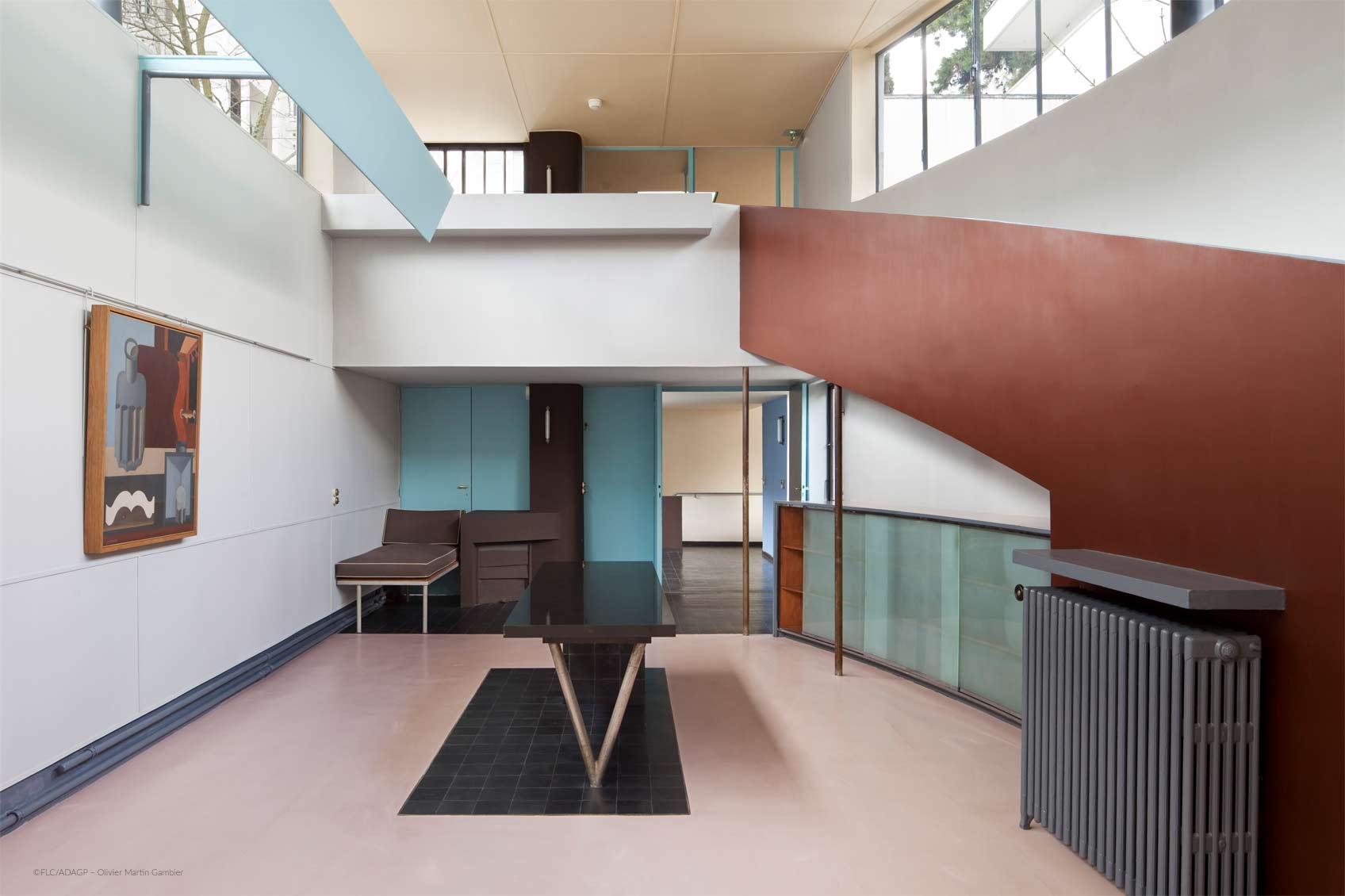
The first attempts of polychromy which Le Corbusier mentions in his Œuvre complète concern the interiors of the houses La Roche and Jeanneret in 1923. Le Corbusier created two coloured "keyboards" for the Basel wallpaper factory Salubra, the first in 1931 and the second in 1959. The pattern cards consist of isolating three to five colours each, each card indicating the spatial effect to be achieved: "space", "sky", ... The colour keyboards are formal expressions of Le Corbusier's way of working and thinking, with which he succeeded in making a theory of colours directly available for practical use. (Source: Fondation Le Corbusier) Le Corbusier's theory of colour reflects his immense experience as a painter, artist, designer and exceptional architect.
Fotos:
Le Corbusier Colour Keyboards ©FLC/ADAGP – Les Couleurs Suisse
Maisons La Roche-Jeanneret ©FLC/ADAGP – Olivier Martin Gambier
Le Corbusier Colour Moods ©FLC/ADAGP – Les Couleurs Suisse
Salubra Original book Colour Moods ©FLC/ADAGP – Les Couleurs Suisse





Comments
No Comments