
The versatility of Le Corbusier’s Whites and other muted neutrals…
White, as we know, is synonymous with modern simple clean lines, associated with a minimalist aesthetic. It is achromatic, devoid of colour, yet despite the absence of colour, it continues to be omnipresent in people's lives: white is the "colour" of purity, innocence and light. It bestows a timeless, airy and crisp feel to any scenario, and is always en vogue. Le Corbusier, like most of the Modernist Movement architects, wanted his designs to always be considered contemporary, to be dynamic and forward-thinking. The Modernist Movement was provocative, whilst still remaining dramatic and romantic; and the white aesthetic was a massively important element of the Modernists.
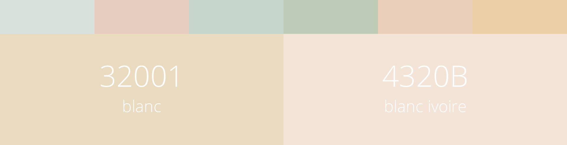
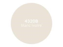
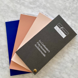
With regard to the additive colour theory, the sum of all the colours adds up to white. Whilst not a cool purist white, 32001 Blanc, the first colour in Le Corbusier’s Architectural Polychromy, is a rich creamy colour which pairs well with all the other 62 colours within the Architectural Polychromy. 32001 Blanc has a very stable aesthetic and is the background colour in the first of the Velvet murals. The second of Le Corbusier’s whites is 4320B Blanc Ivoire, which is an elegant chalky calm colour, reminiscent of the spectacular ivory tusks of the majestic elephant. As with the first colour in Le Corbusier’s palette, 4320B Blanc Ivoire also possesses yellow undertones, and its versatility is vast, enabling it to be used in a multitude of scenarios.

Le Corbusier referred to the rich and relaxing 32001 Blanc as an ideal background colour. It is reminiscent of rich Devon cream teas, with its pale yellow warm calming undertones, and is an extremely adaptable neutral. Let’s explore the versatility of 32001 Blanc and how it can be utilized in a chic, serene and predominantly monochromatic palette. 32001 Blanc and 4320B Blanc Ivoire are both quite creamy buttery colours, enabling both to work in harmony with 32060 Ocre, a natural sandy restrained hue; 32142 Ombre Naturelle Claire another natural shade also adds another dimension; and finally we introduce 4320J Terre d’Ombre Brûlée a dark natural burnt brown pigment. Together, these five colours create a soothing and sophisticated tonal scheme, with an accomplished, retreat-like feel to it.

Despite the fact that Le Corbusier’s 32001 Blanc is not a pure clinical white, all whites can make an area feel more spacious, even affirmative. Using texture in primarily white interiors will add depth and dimension to the space, which is important in a white on white scheme. When layering whites and creams, and pale yellows, we notice that the differing tones interact very sympathetically together, but adding texture really layers, adds depth and introduces some intrigue. Recap about using textures in our previous article “How to deal with different textures in a colour concept” where we explored a little the importance of introducing textures into a scheme.
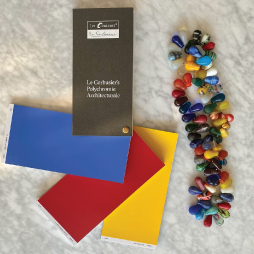
For a more vibrant palette which exudes enduring elegance, wellness and confidence, we have united 32001 Blanc with the reflective ultramarine blue 4320T Bleu Outremer Foncé, the aristocratic 32040 Vert Anglais and the dark and sophisticated 4320J Terre d’Ombre Brûlée. This palette, using 32001 Blanc as the base is confident, a little mysterious and quite dramatic in its composition, whereby you can almost touch the flow of positive energy.

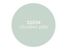
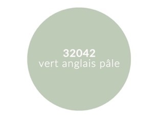
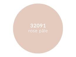
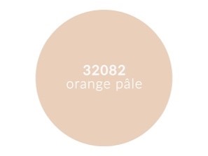
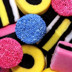
A plethora of "off-white" muted neutral tints can be achieved by adding white to small amounts of colours, creating soft pinks, minty greens etc and these are favoured by many design professionals. Pastels are soothing, coaxing and proven to alleviate tension, by being naturally restful on the eye. Achieving a pale or de-saturated backdrop to a scheme is easily achievable using a selection of muted colours from the Architectural Polychromy, namely: 32024 Outremer gris, 32034 Céruléen pâle, 32042 Vert anglais pâle, 32082 Orange pâle and 32091 Rose pâle.

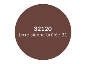
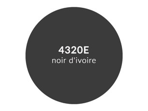
Pastel colours are often emotionally satisfying to people, evocative of past experiences and treasured memories, creating calm in our often frenzied lives, and can achieve an ambiance of informal elegance when used in interiors. Bursts of stronger contrasting colours used in a pastel composition will add energy to the space and prevent a drained feel to the space. Some options to use could be 32120 Terre Sienne Brûlée 31, 32121 Terre Sienne Brique and 4320E Noir d’Ivoire. These darker hues bring warmth and interest to a pastel palette and being such natural tones look beautiful in an interior setting, and with the addition of fresh seasonal plants and foliage really creates a feeling of wellness and happiness.

See how the same muted pastels have been transformed with the simple addition of some darker, warmer, stronger hues. The change in the pastels’ weight has increased and the muted hues now have much more presence and appear more contemporary.

So why not reflect on the reflective qualities of the world’s most inherently versatile non-colour of white and consider how easy it is to introduce elements of innocence, empowerment, luminosity, calm, purity and spiritual focus through the medium of white into your future projects. White is the blank canvas that so many of us need in our lives right now – fulfilling a desire for peace, happiness and uncluttered alluring beauty. In addition, remember that colour evokes joy in people’s lives, even when in its pastel incarnation; pastels are such versatile colours – all thanks to the versatility of white.


Comments
No Comments